A small piece of the bigger picture

Because I’m always researching musical artists, albums, songs and lyrics, my social media feed often sends me things related to these topics. I saw something pretty cool the other day that I thought would make a great idea for a quiz on Hack’s Back Pages.

In the ’60s, ’70s and ’80s, when we bought a new album, we held it in our hands and studied the album cover. The artful depictions were alternately fascinating, enigmatic, shocking, busy, sublime, even boring sometimes, but we looked at them so often, they became deeply ingrained images that still register today. Or do they?

What if you were to see only a small fraction of a classic album cover? Could you still recognize it?

I perused several dozen well-known album covers from the classic rock era, saved the images, then cropped way in so that only about 10% of the cover is visible. Below you’ll find 25 album covers you would likely recognize if you saw the entire images, but can you identify them from the small sections I’ve captured?

Study the partial images, jot down your guesses, and then scroll down to see how well you did, and learn some background on how the covers were created. There’s a Spotify playlist at the end to enjoy later.

*************************

#1

#2

#3

#4

#5

#6

#7

#8

#9

#10

#11

#12

#13

#14

#15

#16

#17

#18

#19

#20

#21

#22

#23

#24

#25

*

*

*

*

*

*

*

*

*

*

*

*

*

ANSWERS:

#1

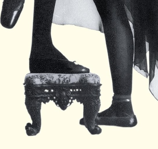
This fanciful cover is the work of Ian Beck, a British illustrator and author of children’s books. He dabbled in album cover illustrations for a short while in the 1970s, turning in an amazing image for Elton John’s “Goodbye Yellow Brick Road,” the 1973 double LP of 20 John/Taupin songs that pay tribute to the movie business.

#2

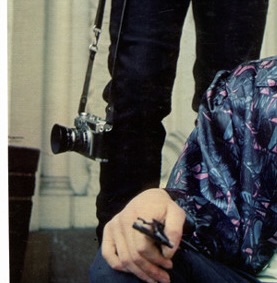
Frank Stefanko, a photographer inspired by film noir movies and reality photographer Diane Arbus, developed a long-time relationship with Bruce Springsteen, conducting many photo shoots with him since the 1970s. He captured the stark image of the star in a small New Jersey house that graces the cover of 1978’s “Darkness on the Edge of Town.”

#3

The artwork for Stevie Wonder‘s landmark 1976 double album “Songs in the Key of Life” is credited vaguely to “Motown Graphics Department.” The story goes that it was designed as a double-edged metaphor — Wonder looking inward for personal visions and outward to the cosmos for divine inspiration.

#4

After watching a TV show on water births, Nirvana‘s Kurt Cobain wanted something similar for their second LP cover. Photographer Kirk Weddle shot photos of 4-month-old Spencer Elden, the son of a friend, at a neighborhood pool, using a dollar bill dangling on a fishhook to symbolize our lifelong pursuit of wealth. The cover of the 1991 album “Nevermind” is one of the decade’s most iconic.

#5

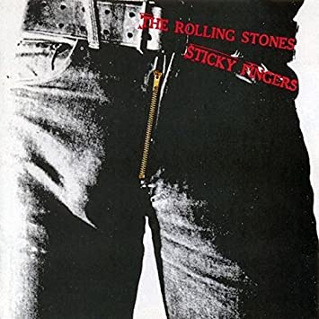
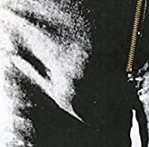
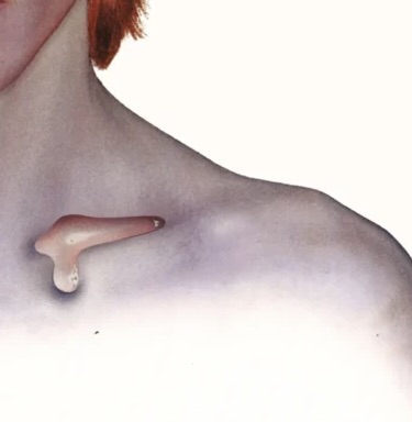
Pop artist Andy Warhol designed this famous image for The Rolling Stones‘ 1971 classic “Sticky Fingers.” Original pressings featured not only a working zipper, but a hidden second cover showing a pair of “tighty whities” and Warhol’s name stamped on each copy. It marked the first release on The Stones’ own record label after their Decca contract expired.

#6

Carlos Santana saw German/French painter Mati Klarwein’s dazzling 1961 work in a magazine one day and insisted that it be selected for use on the cover of Santana’s 1970 classic second LP “Abraxas.” Klarwein went on to contribute art for several other albums in the 1970s by the likes of Miles Davis, Herbie Hancock, Earth Wind & Fire and Gregg Allman.

#7

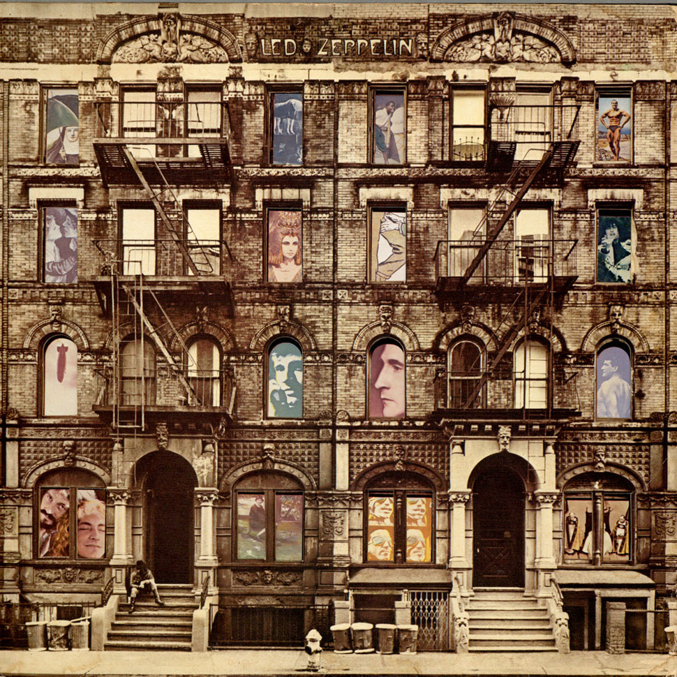
Two adjacent five-story apartment buildings (with the fourth stories airbrushed out) in New York City’s East Village were used on the award-winning die-cut album cover for Led Zeppelin‘s 1975 extravaganza, “Physical Graffiti.” Designer Peter Corrosion used interchangeable inner sleeves to depict various people in the window slots. One sleeve uses letters in the windows that spell out the album title.

#8

For the cover of their next album, “Morrison Hotel,” in early 1970, The Doors hired legendary rock music photographer Henry Diltz to shoot them in front of the actual Morrison Hotel in downtown L.A. The manager refused permission, so they waited until the front desk clerk was called away before quickly taking positions in the front window while Diltz snapped a few frames to get what they wanted.

#9

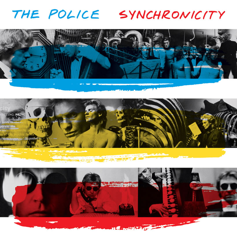
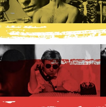
Jeff Ayeroff and Norman Moore came up with the cover artwork using a variety of different photos of band members Stewart Copeland, Sting and Andy Summers, overlaid by horizontal stripes of the three primary colors. In one of more than 30 variations, the middle montage showed Sting reading a copy of Carl Jung’s book “Synchronicity,” on which The Police‘s 1983 LP was based.

#10

Big Brother and the Holding Company‘s lead singer, the incomparable Janis Joplin, was a huge fan of underground comic books. She commissioned the great Robert Crumb to illustrate the song titles and band members for the back cover art, but once she saw the result, Joplin insisted it be on the front cover. The album title (originally “Sex, Dope and Cheap Thrills“) was shortened by the record label.

#11

Elliot Landy rivaled Henry Diltz as the “go to” rock photographer in the late ’60s and early ’70s, shooting important covers for Bob Dylan (“Nashville Skyline”) and Van Morrison (“Moondance”) and portraits of Jimi Hendrix, Jefferson Airplane, Frank Zappa and others. His work appears on the covers of “Music From Big Pink” and “The Band,” the first two LPs by Robbie Robertson, Levon Helm and company.

#12

For the cover of his 1978 jazz-influenced album “52nd Street,” Billy Joel was photographed leaning against the dingy side of the Griddle Coffee Shop at 7th Avenue and 52nd Street in Manhattan, once a popular hangout location for jazz musicians, and just a block away from the CBS Building and the studio where the album was recorded.

#13

Many psychedelic rock bands used oils and waters on a glass surface projected onto huge screens behind the bands to add trippy visuals to the acid rock music being performed. For the cover of their “In-A-Gadda-Da-Vida” album in 1968, Iron Butterfly used an image by photographer Stephen Paley of the group on stage that year with the liquid light show behind them.

#14

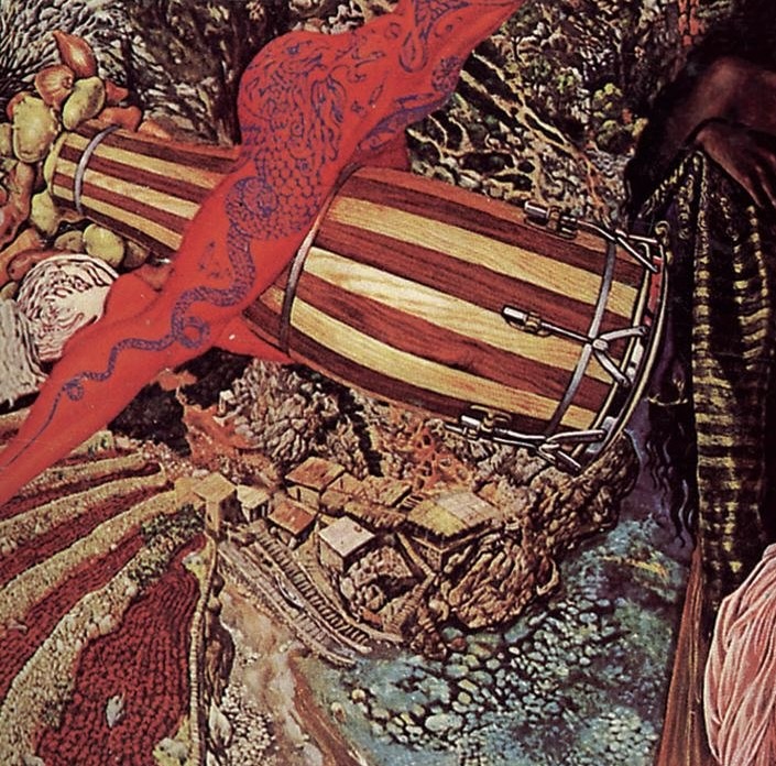
Keith Emerson became fascinated with the “biomechanics” artwork of Swiss artist Hans Reudi Giger, and in 1973, Giger was commissioned to create two pieces to serve as an outer (mechanical male) cover and inner (human female) cover for the new Emerson, Lake & Palmer album, “Brain Salad Surgery.” Giger also designed a new ELP logo as part of the outer cover that was used on all subsequent releases.

#15

When John Lennon re-entered the public arena in 1980, he was adamant that his new songs be presented in partnership with the new offerings of his wife, Yoko Ono. The album, entitled “Double Fantasy,” alternated ballads and rockers from each artist, all focusing on their idealized romance. Ono selected acclaimed Japanese photographer Kishin Shinoyama to capture the loving couple in mid-kiss.

#16

The cover for Fleetwood Mac‘s ubersuccessfulRumours” album bears some resemblance to the 1975 “Fleetwood Mac” album that precedes it. Photographer Herbert Worthington and designer Desmond Strobel again featured 6’6″ Mick Fleetwood’s beanpole frame, but this time he was paired with sultry songstress Stevie Nicks in her diaphanous stage garments, lending a ballet-like aura to the image.

#17

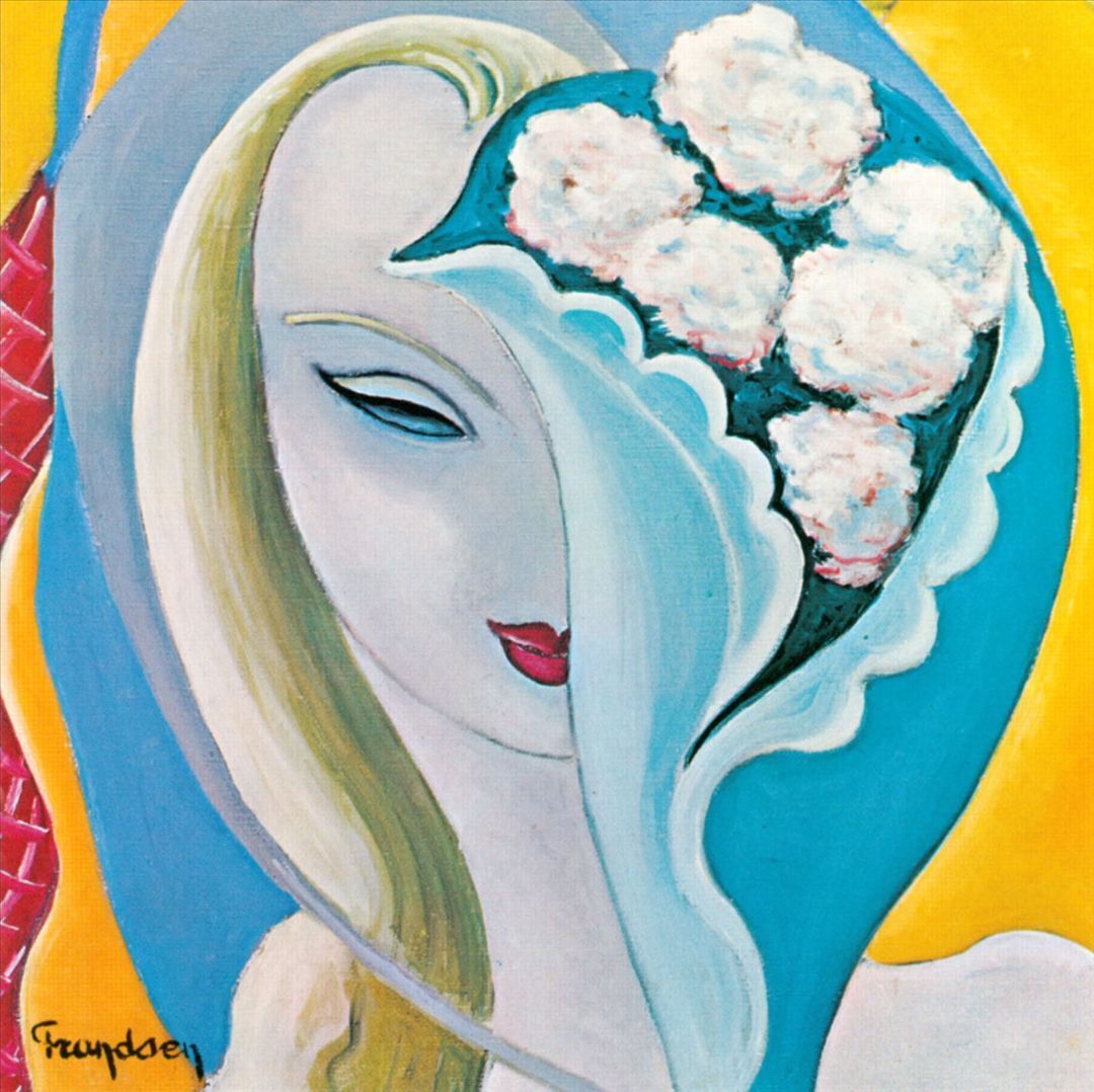
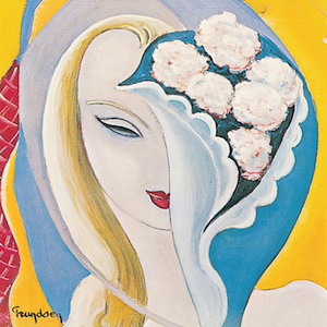
When Eric Clapton first spied “La Fille Au Bouquet,” a painting by French artist Émile-Théodore Frandsen de Shomberg, he saw a strong resemblance between the girl depicted and his obsessive love interest, Pattie Boyd Harrison, the subject of his brilliant tune “Layla.” The painting became the cover art for “Layla and Other Assorted Love Songs,” the 1970 double LP by Derek (Clapton) and The Dominos.

#18

For his hugely influential 1965 LP “Highway 61 Revisited,” Bob Dylan was photographed sitting on the front stoop of manager Albert Grossman’s apartment in Gramercy Park in Manhattan. Photographer Daniel Kramer, who positioned Dylan’s cohort Bob Neuwirth behind Dylan “to give the shot extra color and depth,” urged Dylan to adopt an expression of “hostile moodiness” that fit his rebel image.

#19

Actors, statesmen, models, singers and celebrities of nearly every stripe were eager to be photographed by acclaimed portrait photographer Richard Avedon in the 1950-1990 era. Paul Simon and Art Garfunkel felt honored that Avedon accepted the assignment to shoot the duo for the cover of their “Bookends” LP in 1968. It was one of only a half-dozen album covers in which he was involved.

#20

Steven Georgiou, later known worldwide as Cat Stevens and then eventually Yusuf, was a promising art student as well as a singer-songwriter. His two most popular albums — 1970’s “Tea For the Tillerman” and 1971’s “Teaser and the Firecat” — feature album cover artwork created by Stevens himself. He used children’s book illustration techniques to complement the gentle music and lyrics of his songs.

#21

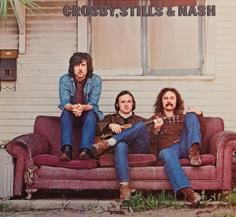
Henry Diltz’s talent shows up a second time in this indelible image of Graham Nash, Stephen Stills and David Crosby sitting on an abandoned couch in front of a condemned home in Hollywood. Realizing they’d been positioned out of order, they returned a few days later to reshoot, but the house had been razed. So the “Crosby, Stills and Nash” album went out as is in the spring of 1969.

#22

It’s one of the most iconic images of David Bowie‘s long career, but it was the only time he wore the striking thunderbolt face makeup. As the cover for the 1973 LP “Aladdin Sane,” the image maintained and enhanced his breakthrough “Ziggy Stardust” persona, with photographer Brian Duffy using an unprecedented seven-color system that made it the most expensive cover ever made up to that point.

#23

Art designer Janet Perr won the 1985 Best Album Package Grammy for this boldly colorful presentation of Rolling Stone photographer Annie Leibovitz’s shot of Cyndi Lauper on Henderson Walk in Coney Island. For the “She’s So Unusual” cover, Lauper wore vintage clothing and accessories she found at Screaming Mimi’s, a vintage clothing shop near there where she once worked.

#24

The design team of Alton Kelly and Stanley Mouse again worked with The Grateful Dead on the cover artwork for their superb 1972 triple live album “Europe ’72.” The triple-gatefold sleeve illustrations feature not only the familiar “truckin'” foot stepping across the Atlantic Ocean to Europe, but also, on the back cover, the “truckin’ fool” smashing an ice cream cone against his forehead.

#25

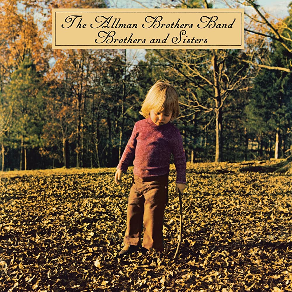
Photographer Dan Hudson Jr.’s bucolic photo of young Vaylor Trucks (son of drummer Butch Trucks) playing in the autumn leaves provides a stark contrast to the tension and grief that surrounded The Allman Brothers Band in 1973 following the deaths of Duane Allman and Berry Oakley. This shot, and a similar shot of Oakley’s daughter Brittany on the back, appear on their “Brothers and Sisters” LP.

****************************************

Can you judge an album by its cover?

If you were an album buyer in the ’60s, ’70s and ’80s, I’d be willing to bet there were times you bought, or were very tempted to buy, a new record based almost solely on the captivating cover art.

Rolling_Stones_1971

I remember doing so in April of 1969 when, armed with some money from my 14th birthday, I riffled through the “underground rock” bin at a traditional record store near my home in Cleveland and first laid eyes on the cover of Led Zeppelin’s debut, released a couple months earlier. At that point, I hadn’t even heard of the group, and I hadn’t heard a note of the music yet. But for some reason, I was spellbound by the cover art depicting the famous explosion of the Hindenburg zeppelin.

Compared to other album covers of that era, it wasn’t all that extraordinary — not shocking, not surreal, not erotic. But I was nevertheless entranced and felt compelled to buy it. It could’ve easily been a dud of a record, but as we all know now, it was a sonic boom, the opening salvo of a new genre that combined heavy blues with vocal histrionics, quicksilver guitar and sledgehammer drumming.

In recent years, when downloadable files became the dominant form of how consumers purchased their music, many of us bemoaned the disappearance of a tangible product to hold in our hands. Thankfully, vinyl LPs have made a big comeback in recent years, and one reason that’s good news is the perpetuation of the extraordinary art form of album cover design.

In the 1960s, ’70s and ’80s, album cover art — be it arresting portrait photography, surreal landscape drawings, erotic paintings or highly stylized logos, to name a few — was an integral, vital component of each new release.  In some cases, the art was so striking that it became as important as the music on the album within.

Most observers pinpoint 1966 as the year when artists — specifically, The Beatles, The Stones, Bob Dylan and a handful of others — saw the perfect opportunity to extend their creativity to a new canvas.  They figured, hey, since we’re spending so much heart and soul creating and producing memorable music, why leave the visual presentation of the product to some record company marketing department hacks?

Album art very quickly became cultural touchstones, using images that reflected either the genre of the music, or the political climate of the time, or the avant-garde sensibilities of the artists and photographers the recording artists chose to create their album covers.

To be fair, the notion of using album covers to make an artistic statement didn’t begin with the great ’60s rock bands.  The debut of the “long-playing” (LP) album in the early 1950s, which replaced the 78-rpm records of the ’30s and ’40s, offered a new canvas for the commercial display of images that might draw buyers’ attention and differentiate an album from the rest of the pack.  Jazz artists like Miles Davis and John Coltrane were among the first to express a desire to put something more…interesting on their LP covers than the garish, cheesy sales appeals favored by profit-minded label executives.

In the rock music arena, though, covers tended to lean toward formulaic, slapdash artwork throughout the ’50s and early ’60s, because that’s what the record labels wanted, and they had the control.  Some were downright embarrassing, as they sought to capitalize on the lame lyrics or novelty aspect of the one hit single (witness Barry Mann’s “Who Put the Bomp” or the cringeworthy “Last Kiss”).  Then again, you could understand why Capitol Records chose to emblazon The Beach Boys’ 1962 album “Surfing Surfari” with a photo of the five guys awkwardly carrying one surfboard (never mind that only one member, Dennis Wilson, had ever surfed before).

You could make a case that the cover of The Beatles’ second album “With The Beatles” (“Meet The Beatles” in the US version) was artistically significant, with its unique display of the group in a three-faces-above-and-one-below arrangement.  But it really wasn’t until the group had their way and insisted on the use of artist friend Klaus Voorman’s unusual pastiche for the “Revolver” cover that the mainstream audience started seeing bold artistic presentations on the covers of the albums they were buying.

And then there’s the groundbreaking “Sgt. Pepper” cover in 1967.  Manager Brian Epstein freaked out when he saw what The Beatles were proposing — the faces of nearly 60 different individuals from past and present, whose approval he would have to seek in order to include them in the mix.  The only one who objected was ’30s/’40s sex siren Mae West, who wondered, “Why would someone like me want to be in a lonely hearts club?”  Meanwhile, it’s interesting to note that only four people on that cover are still alive today, and two of them are Beatles…  And how cool of the band to turn right around on their next record and offer the most minimalist art conceivable:  A plain white cover for “The Beatles” (AKA “The White Album”).

At that point, album cover art exploded, with fabulous and disastrous results.  It was banana-bizarre (“The Velvet Underground and Nico” and the Mothers of Invention’s “Weasels Ripped My Flesh”).  It was animated fun (Janis Joplin’s “Cheap Thrills”).  It was psychedelic (Jimi Hendrix’s “Axis:  Bold as Love” and Iron Butterfly’s “In-a-Gadda-Da-Vida”).  It was mildly disturbing (King Crimson’s “In the Court of the Crimson King” and Captain Beefheart’s “Trout Mask Replica”). It was simple portraiture (the front porch snapshot for “Crosby Stills & Nash” and the dime-store machine photo for “Songs of Leonard Cohen”).  It was understated (Joni Mitchell’s delicate line art for “Ladies of the Canyon” and Carole King’s domestic serenity for “Tapestry”).  It was retro (Pure Prairie League’s use of Norman Rockwell artwork and The Grateful Dead’s faded Americana photo on “Workingman’s Dead”). It was just plain silly (the garish carnival claim of “50,000,000 Elvis Fans Can’t Be Wrong” and The Mamas and The Papas wedging themselves into a bathtub for “If Can Believe Your Eyes and Ears”)

Artists chose famous photographers to capture their images in just the right way (Richard Avedon’s portrait of Simon and Garfunkel on “Bookends” comes immediately to mind).  Eric Clapton selected a painting by Frandsen de Schomberg, which he felt resembled Pattie Boyd Harrison, his heartbreaking muse for the Derek and the Dominos classic “Layla” LP.  The cover painting of the shabby beggarman for Jethro Tull’s “Aqualung” cover was expressly commissioned (although leader Ian Anderson said he would’ve preferred the photograph of a homeless man his wife had taken months earlier).

If the covers of record albums are designed to be attention-getting, then perhaps the most famous (or infamous) of all is The Rolling Stones’ 1971 classic, “Sticky Fingers.”  It features a closeup of a male crotch, clad in tight jeans with a noticeable package and, on the original vinyl LP release, an actual working zipper.  And that’s not all;  the belt buckle had perforations that allowed buyers to peel back the jeans and reveal a sub-cover featuring a pair of “tighty whities” and the gold-embossed name of ’60s art icon Andy Warhol, who came up with the cover concept.

Some of the groundbreaking artwork on albums of the ’70s remains lasting and important many decades later.  Bruce Springsteen’s “Born to Run” gatefold with saxophonist Clarence Clemons may be THE quintessential rock pose of that decade;  David Bowie’s lightning-bolt image on “Aladdin Sane” is still adorning t-shirts today;  Peter Gabriel’s otherworldly “Face Melt” evokes Twilight Zone-ish moods;  Traffic’s hexagonic die-cut “Low Spark of High-Heeled Boys” broke the mold on album cover dimensions;  the shocking/erotic photo of half-naked ladies on Roxy Music’s “Country Life” was banned in many states and countries;  the pop-up defaced schoolroom desk of Alice Cooper’s “School’s Out” took album covers from two to three dimensions.

Perhaps the most prolific album art purveyor was a hip London outfit known as Hipgnosis, responsible for the design and execution of many dozens of memorable covers of the period, none more notable than the prism/spectrum depicted on Pink Floyd’s “Dark Side of the Moon.”  The Hipgnosis designers also handled cover art for every other Pink Floyd cover, plus major releases by Led Zeppelin, The Police, ELO, Genesis, Alan Parsons Project, Yes, Al Stewart and Renaissance.

Homage must also be paid to the great Roger Dean, who created some of the most fantastical visual landscapes for his album cover art for Yes and a few other bands.  And H.R. Giger’s work for Emerson Lake & Palmer’s “Brain Salad Surgery” broke new ground and must be singled out.

Some bands defied the “anti-corporate” ideal by creating logos that made the bands into brands.  Every single album by Chicago has the “Chicago” logo proudly displayed.  Most Stones albums contain the “lips and tongue” logo — if not on the cover, then elsewhere in the packaging.

Art imitated art (as it always has) in 1980, when the rebellious British band The Clash chose to emulate Elvis Presley’s 1956 debut LP cover design when it used the same typeface and layout on its “London Calling” album.  Some fans barely noticed, but artists took note, for sure.

So why has album art been such a big deal?  Part of it has been the visceral thrill of tearing off the shrink wrap of a new album and soaking in the visual at the same time you listened to the aural.  It was like opening a big picture book and following along as the musical story unfolded.  A lot of this had to do with the inclusion of song lyrics, which had never occurred to anyone, apparently, until they showed up on the rear side of the “Sgt.Pepper” LP.

In the 1980s, even as the 12″x 12″ canvas of album covers gave way to the decidedly inferior 6″x 6″ format of CD covers, notable album art design continued to flourish. Bands like Duran Duran, Debbie Harry, The Eurythmics, Culture Club and The Cars used the bold, stark lines of ’80s advertising styles and Alberto Vargas pin-up girls, which seamlessly tied the sounds of the New-Wavish music to the dynamic, chic visuals that dominated the worlds of fashion and style at that time.

Madonna ruled the airwaves in the ’80s, and her acute fashion sense was hugely evident in the way she used her album covers to promote her too-cool persona, especially on LPs like “True Blue” and “Like a Virgin.”  The same held true for fun-loving Cyndi Lauper, whose 1985 chart-topper “She’s So Unusual” and its anthem “Girls Just Want to Have Fun” set the standard for young women’s devil-may-care fashion for most of the decade.

Heavy metal bands certainly didn’t neglect the chance to showcase their in-your-face stance and vaguely threatening personas.  Album covers like Ozzy Osbourne’s “No Rest for the Wicked” and Ted Nugent’s “Scream Dream” reached out and throttled consumers as they walked down the aisle at Tower Records.

Even though most artists weren’t releasing vinyl albums by then, Nirvana and other leading ’90s bands still chose to take advantage of the artistic palette available in “album” cover art (even though it was on the significantly smaller CD booklet dimension).  There may be very few artistic images of the 1990s more indelible than the floating baby and the dollar bill on the fishing line that comprise the “Nevermind” cover art.

There have been SO MANY great album covers displaying fantastic works of art over the years.  Trying to list the best of them is a fool’s errand.  It’s like trying to list the proverbial “Best 50 Albums of All Time.”  Very subjective, and very limiting.  It would be easier to list the best photo album covers, the best art covers, the best illustration covers, and so on.

But here’s the thing:  It’s safe to say that clicking a few buttons on your laptop and glancing at digital images passing by on your computer screen is nowhere near as satisfying as holding an album-sized image in your hands.  It’s almost like the difference between driving a car and looking at a picture of one.

It’s good to know that the latest generation of music lovers are plunking down the money to buy turntables and relatively pricey vinyl versions of the latest releases.  Not only are they rewarded with better sounding recordings of the songs they want, they’re once again getting full-size art, presented in the way the artists originally intended.

IMG_0788

Some of us, in fact, are so crazy about great album covers that we FRAME them and mount them on our walls, as I did several years ago in my Santa Monica home office…