They’re like pieces of art
If you have ever been an album collector, especially in vinyl form, you probably can quickly call to mind the album cover artwork of your favorite LPs. Even if you didn’t own them, many albums of the ’60s, ’70s and ’80s had iconic images that you saw in the record stores or in your friends’ vinyl collections. The question I pose to you is: How well do you remember them today?

In this, my third Album Cover Art Quiz, I have selected two dozen classic rock albums whose covers are likely recognizable to a significant portion of music listeners and fans. Because most album covers include the artist’s name and the album title, I couldn’t just display the cover without giving away the answer. So I went in and cropped small segments of the covers that include key visual elements. Your job is to slowly scroll through the two dozen images below and jot down which albums you think they’re taken from. Then scroll further for the answers and some interesting backstories on how the artwork was originally generated.
I hope you enjoy trying to identify these album covers. There’s a playlist at the end with one track from each album in question, so don’t look at it until you try the quiz!
****************************
#1
#2

#3

#4
#5
#6

#7

#8
#9
#10
#11
#12

#13
#14
#15

#16
#17
#18
#19
#20
#21

#22
#23

#24
****************************
*
*
*
*
*
*
*
*
*
*
*
*
*
*
ANSWERS:
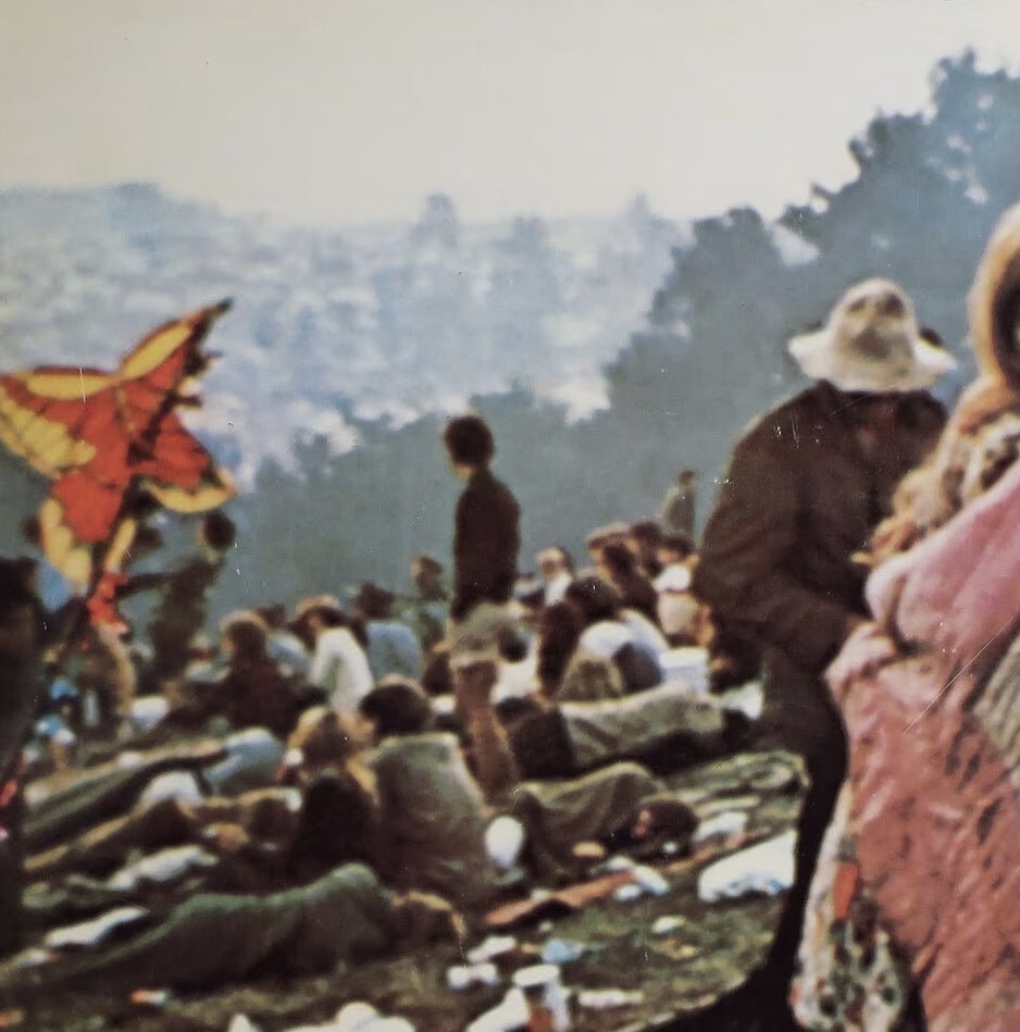
#1
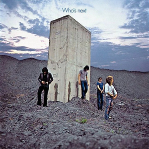
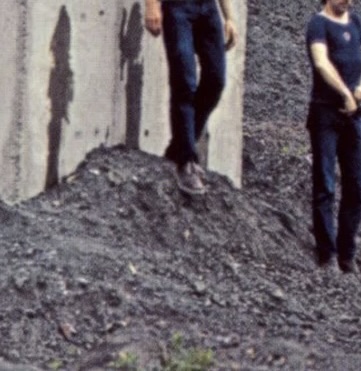
“Who’s Next,” The Who, 1971
While driving through the coal-mining regions of England in 1971, The Who spied a large concrete piling incongruously jutting out of an enormous slag heap. Pete Townshend took a leak on it, and the others followed suit while photographer Ethan Russell took a few photos. Later, when the band was mulling over various ideas for the cover art for their “Who’s Next” LP, they couldn’t agree on what to do, and Townshend threw up his hands and said, “Let’s use the shot of us pissing on the piling.” The sky in the background was added later by art director John Kosh in order to give the image what Russell called “this other worldly quality.” Townshend later said of the cover, “It brings new meaning to the phrase ‘taking the piss out of something’ (a British term for mocking or ridiculing).
#2
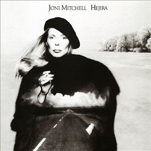
“Hejira,” Joni Mitchell, 1976
Entitled after the Arabic word meaning “departure” or “exodus,” this brilliant 1976 album, her ninth, features songs with lyrics centered around the common theme of travel (“Refuge of the Road,” “Black Crow,” “Coyote,” “Amelia”). Photographer Norman Seeff shot the sleek, arty portrait of Mitchell wearing a beret and holding a cigarette, while Joel Bernstein took the stark winter skating shots, and art director Keith Williamson superimposed the photo of the empty highway disappearing into the distance. “A lot of work went into creating that cover,” Mitchell said. “I was particularly proud of that one.”
#3

“Ghost in the Machine,” The Police, 1981
The cover art for The Police’s fourth LP, 1981’s “Ghost in the Machine,” uses a red graphic on black background inspired by the sixteen-segment display used to show alphanumeric symbols on computers, video recorders and digital watches. According to art director Jeff Ayeroff and Mick Haggerty, the three graphic figures are meant to depict the heads of the three band members with their different hairstyles. I’m not sure I see it, but I nevertheless find the cover compelling to look at. The band named the album after Arthur Koestler’s 1967 book about philosophical psychology, which theorizes that the mind and body are separate entities, and the mind is the ghost while the body is the machine. Sting had been reading it at the time the album was recorded.
#4
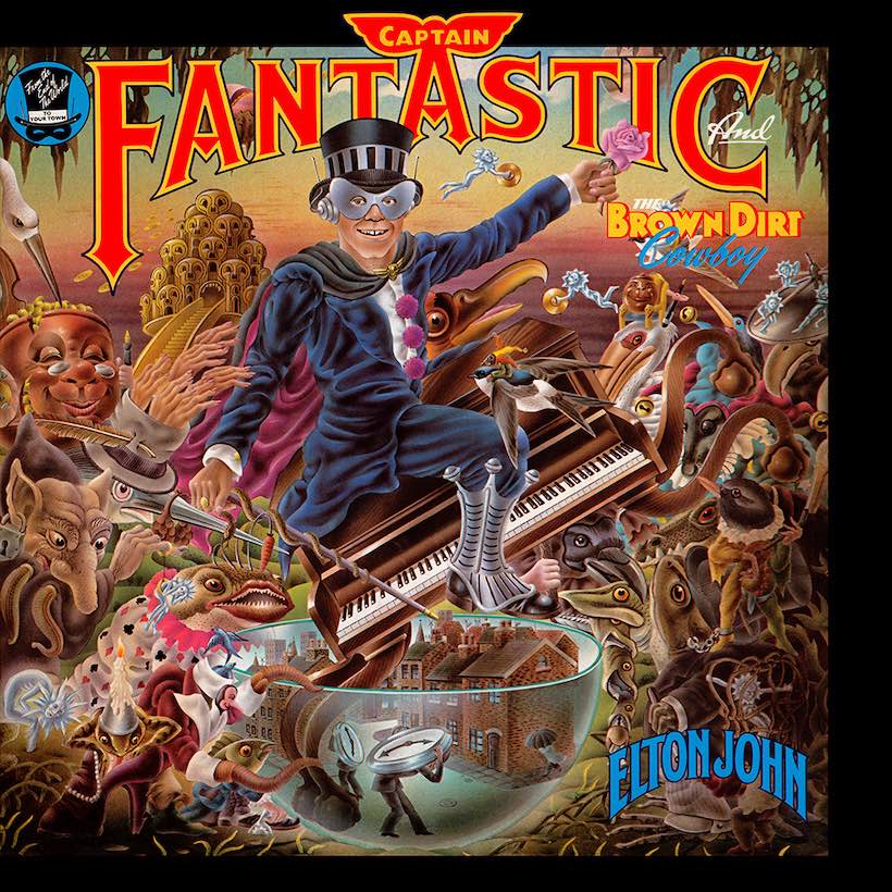
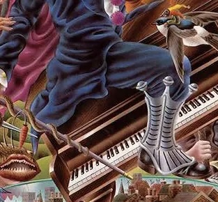
“Captain Fantastic and The Brown Dirt Cowboy,” Elton John, 1975
Alan Aldridge was a London-based artist/illustrator/designer who had four claims to fame. He created the two editions of the well-known “The Beatles Illustrated Lyrics” books; he was responsible for creating the original art for The Rolling Stones’ iconic “tongue and lips” logo; he served as chief illustrator for Penguin Paperback Books, conceiving dozens of designs for science fiction novels; and in 1975, his work graced the cover of Elton John’s #1 LP “Captain Fantastic and the Brown-Dirt Cowboy.” Inspired by Dutch painter Hieronymus Bosch’s famous “Garden of Earthly Delights,” Aldridge depicted many dozens of items and artifacts from the life stories of John and lyricist Bernie Taupin.
#5
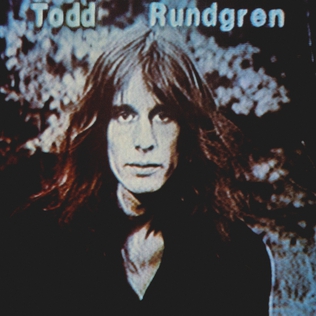
“Hermit of Mink Hollow,” Todd Rundgren, 1978
Following two years of intense work in the studio and on the road with his erstwhile band Utopia, Rundgren found his six-year relationship with model Bebe Buell was coming to an end. He said he felt the need to isolate on the upstate New York property where he had built a studio, located in the town of Lake Hill on Mink Hollow Road. There he recorded the batch of quasi-autobiographical pop and rock songs that comprised his 1978 LP “Hermit of Mink Hollow.” For the cover art, Rundgren used a blue-tinted video screen image of himself alone in his garden to underscore the self-exploring nature of the project.
#6
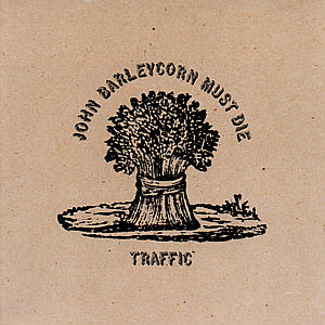
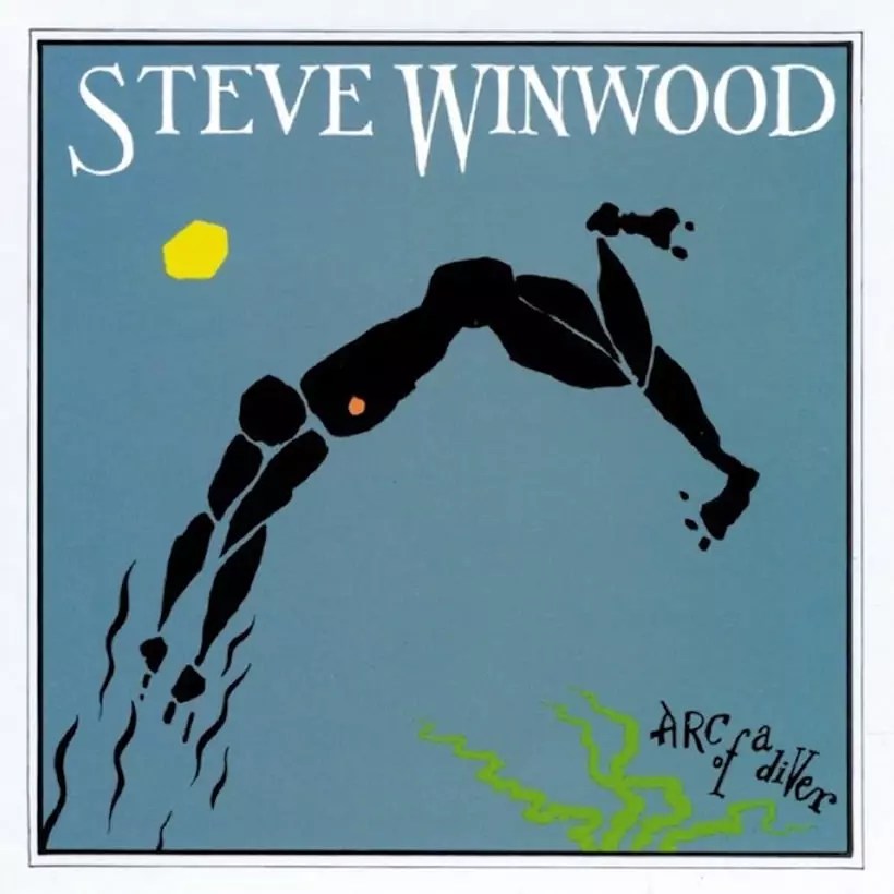
“John Barleycorn Must Die,” Traffic, 1970
When Steve Winwood set out to make his first solo LP in 1970, he soon found he missed the collaborative nature of his work with former bandmates Jim Capaldi and Chris Wood, so he reunited with them and the project became a new album by Traffic. The songs incorporated elements of jazz, rock and folk, including their interpretation of a 16th Century Scottish folk song called “John Barleycorn,” a personification of barley and the beer cultivated from it. Once the group chose to title the LP after that song, album designer Mike Sida created the illustration of a bundle of barley and put it on a background photo of brown burlap, which furthered the “back to nature” sense Winwood was trying to advance.
#7

“Touch,” The Eurythmics, 1983
When The Eurythmics shot the music video for their breakthrough single “Sweet Dreams (Are Made of This),” singer Annie Lennox flouted her androgynous appearance, wearing men’s suits and dyeing her hair shocking orange. She maintained that look for a photo shoot later that year for the cover of The Face, a British fashion/music/culture magazine. Lennox and her synth-pop partner Dave Stewart liked the photo so much they used it for the album cover of “Touch,” The Eurythmics’ third LP. The photo was taken by Peter Ashworth, who worked on album covers for many artists including Tina Turner, The Smiths, Robert Palmer, Bryan Ferry and Depeche Mode.
#8
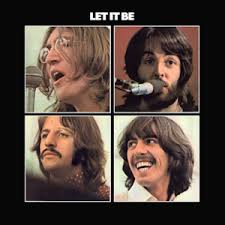
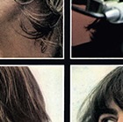
“Let It Be,” The Beatles, 1970
Recorded during a tumultuous period in early 1969 and not released until May 1970 after the group’s breakup, “Let It Be” garnered mixed reviews from the press and the public alike. In his review for The London Sunday Times, Derek Jewell described the album as “a last will and testament, from the blackly funereal packaging to the music itself.” Art designer John Kosh, who has designed more rock album covers than almost anyone in the business, chose four Ethan Russell photos and displayed them in four separate boxes on a black background, symbolizing The Beatles were no longer a band but four individual artists.
#9
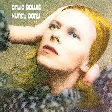
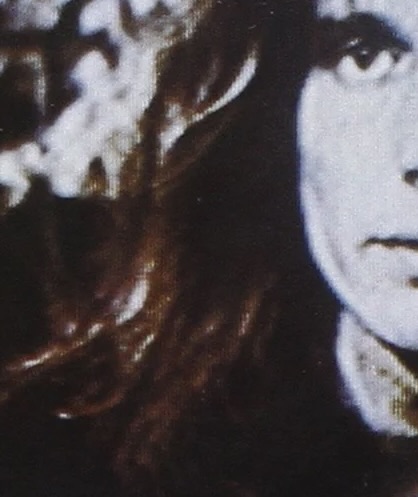
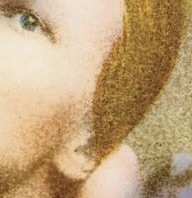
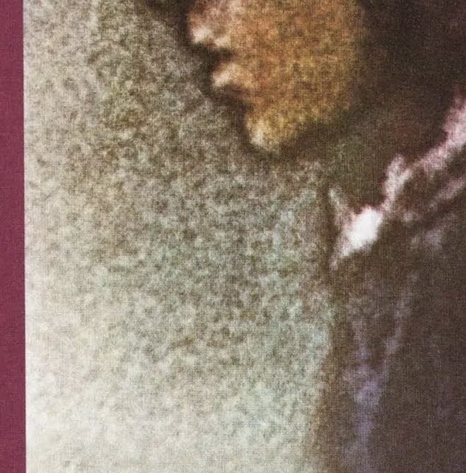
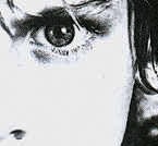
“Hunky Dory,” David Bowie, 1971
At first, the ideas for the cover of Bowie’s “Hunky Dory” LP was to dress him as a pharaoh, partly because of the media’s infatuation with the British Museum’s then-new King Tut exhibit. That concept was shelved in favor of a more minimalist image reflecting the album’s preoccupation with the silver screen. Photographer Brian Ward captured Bowie in close-up looking past the camera in a pose recalling Hollywood icon Greta Garbo. Originally shot in monochrome, it was then “recolored” by illustrator Terry Pastor (who went on to design the “Ziggy Stardust” album cover as well) in order to call to mind the hand-tinted lobby cards of the silent film era.
#10
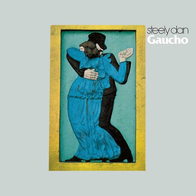
“Gaucho,” Steely Dan, 1980
A gaucho is defined as a skilled horseman experienced in traditional livestock farming common in Argentina, Brazil and Uruguay. The typically cryptic lyrics to Steely Dan’s song “Gaucho” has more to do with a sordid relationship between a young man and his friend in his “spangled leather poncho,” a “bodacious cowboy who will never be welcome here.” When the time came to devise the cover for the 1980 LP, also titled “Gaucho,” art director Suzanne Walsh suggested making a duplicate of “Guardia Viejo Tango,” a low-relief sculpture by Argentine artist Israel Hoffman, and then photographing it against a grey background. Donald Fagen and Walter Becker loved it and the fact that it hinted at the partners’ strained relationship at that point in their career.
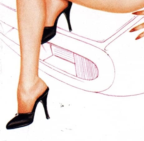
#11
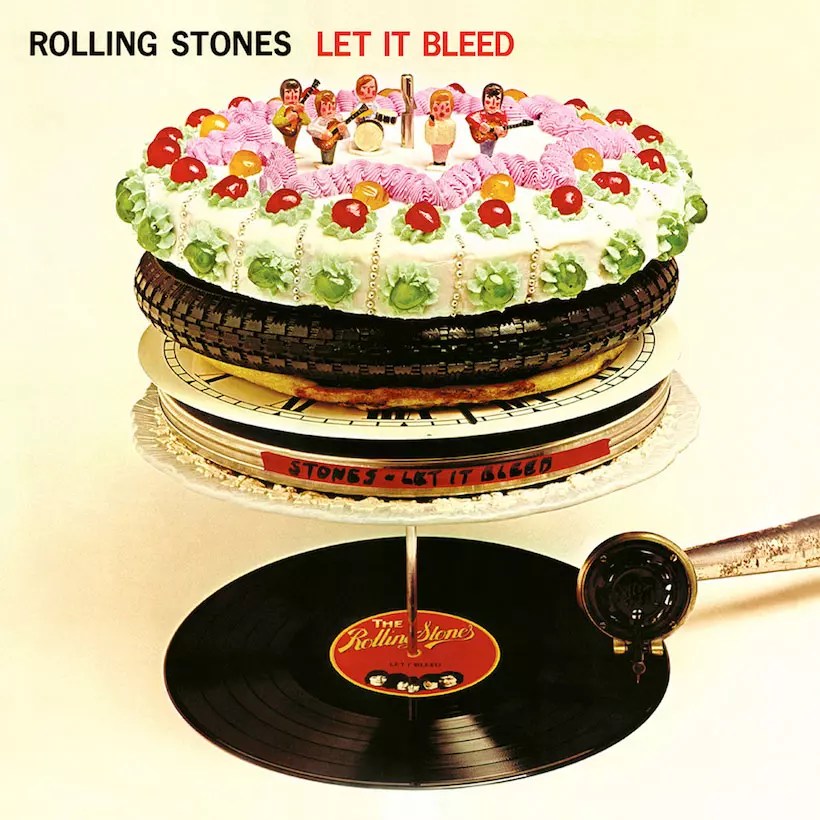
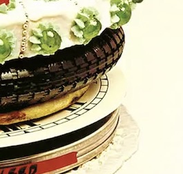
“Let It Bleed,” The Rolling Stones, 1969
Mick Jagger reached out to iconic Dutch artist M.C. Escher to design the cover for “Let It Bleed,” but he declined, so the band hired American graphic designer Robert Brownjohn, who was noted for blending formal design concepts with wit and 1960s pop culture. He came up with the surreal 3D sculpture of a Rolling Stones vinyl record on a spindle with an old victrola-type tone arm. Stacked above the album on the spindle were not more albums, but other incongruous objects like a clock face, a pizza, a bicycle tire and a cake with elaborate icing. On the back cover, the same sculpture is shown as if a slice of the stacked items has been removed, with the tone arm lying damaged.
#12
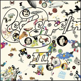
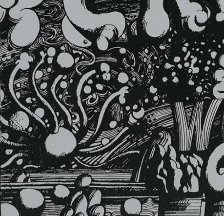
“Led Zeppelin III,” Led Zeppelin, 1970
For Led Zeppelin’s third album cover, Jimmy Page commissioned a multi-media artist known as Zacron, an old friend from Page’s art school days. Zacron came up with the startlingly busy design: a surreal collection of seemingly random images on a white background, many of them sharing the theme of flight or aviation. Behind the front cover was a rotatable laminated card disc, covered with more images, including photos of the band members which showed through die-cut holes in the cover when the disc was moved into place. Production of this cover design for “Led Zeppelin III” was so complicated and time-consuming that it delayed the release of the album an additional two months.
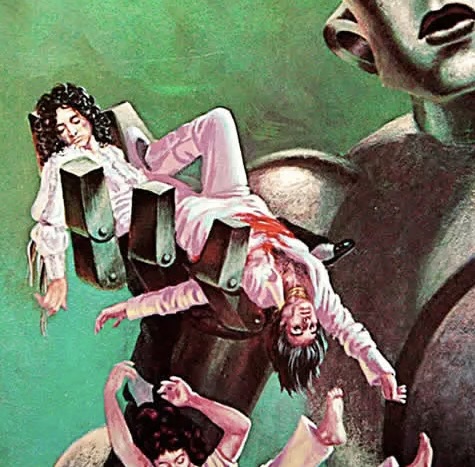
#13
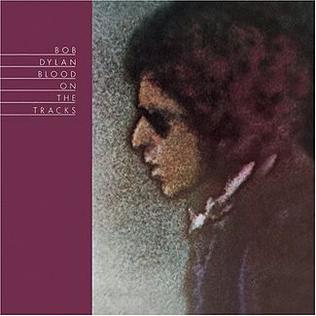
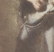
“Blood on the Tracks,” Bob Dylan, 1975
While the album cover image of Dylan here looks like a painting, it is in fact a photograph of the artist taken with a telephoto lens at a concert in 1974 by Paul Till. When developing the film, Till solarized it to achieve the effect of tone reversal, and then hand-colored it using watercolors. Ron Coro, art director at Columbia Records, later retouched Dylan’s profile features for better clarity. It’s one of the more enigmatic cover depictions of Dylan’s image in his 40-album repertoire, and quite fitting for the autobiographical songs that are found on “Blood on the Tracks,” released in January 1975.
#14
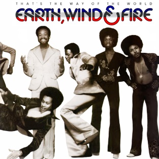
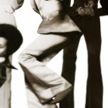
“That’s the Way of the World,” Earth, Wind & Fire, 1975
For the photo shoot, photographer Norman Seeff asked the nine members of Earth, Wind & Fire to line up in flamboyant clothing against a white backdrop and “do whatever comes naturally.” For a few, that meant standing still and smiling; for others, it meant breaking out in dance moves or jumping off the ground. For one, it even meant faking a fall. The finished product offered a light, spirited, almost goofy vibe that conveyed to the listener that the album was full of different styles, all fun and entertaining. “That’s the Way of the World” introduced the group to mainstream America and reached #1 on US album charts in 1975, kicking off a six-album run of consecutive Top Ten chartings.
#15

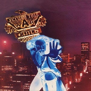
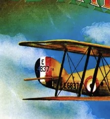
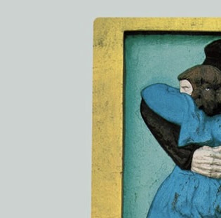
“War Child,” Jethro Tull, 1974
Although it’s nondescript enough to be any cosmopolitan city, the positive color print for the cover of Tull’s seventh LP is, in fact, Melbourne, Australia. Why Melbourne? No idea. Superimposed over that is a somewhat intimidating negative image, bathed in blue, of Ian Anderson, wielding a pole that holds a gold shield-like image of a “War Child” logo. Anderson has never expounded much on what he was aiming for with this cover, but the back cover, if you’re interested, is more straightforward, lightheartedly showing band members and various friends and record label people dressed in costumes meant to depict the subjects of the ten songs found on the album, which peaked at #2 in the US when released in 1974.
#16


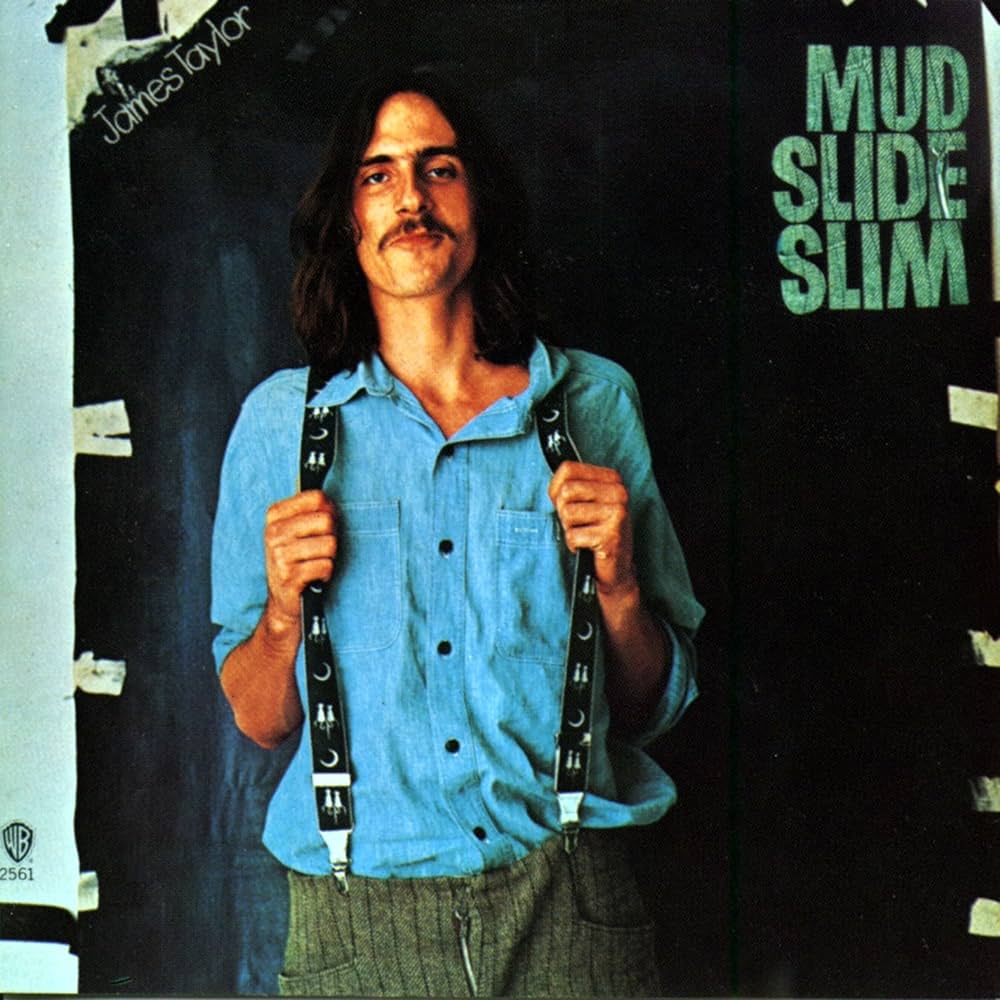
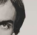
“JT,” James Taylor, 1977
While the ’70s were full of album cover art that was often busy and multi-dimensional, there were also examples of simple portraiture that served as a throwback to the early days of LPs in the 1950s. “JT,” Taylor’s effervescent eighth album, pictures the singer-songwriter in closeup, looking not exactly joyous, but certainly happy, clean and well-lighted. The album includes such upbeat tunes as “Your Smiling Face,” “Handy Man” and “Honey Don’t Leave L.A.” while still making room for mellow introspection on “There We Are,” “Secret O’ Life” and “Terra Nova.” Photographer David Alexander and veteran art director John Kosh captured Taylor perfectly for this batch of material.
#17
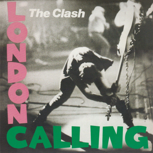
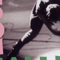
“London Calling,” The Clash, 1979
Graphic designer Paul Lowry took one look at photographer Pennie Smith’s shot of bassist Paul Simonon smashing his instrument on the stage in frustration at a 1979 concert and knew it was destined to be the cover of The Clash’s new LP. At first, Smith was hesitant about it, saying the image was too out of focus because she’d been backing away from Simonon as he approached the edge of the stage, but the shot has since been called one of rock music’s all-time most vivid cover images. Lowry chose to mimic the same type face and pink and green colors used so effectively on Elvis Presley’s 1956 debut album.
#18
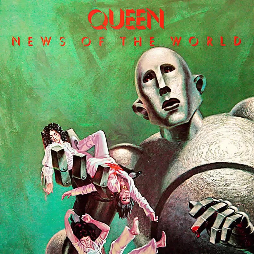
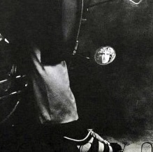
“News of the World,” Queen, 1978
Back in 1953, American sci-fi artist Frank Kelly Freas had his work displayed on the cover of an issue of Astounding Science Fiction magazine — a giant intelligent robot with a concerned look on its face, holding up the dead body of a human and asking, “Please…fix it, Daddy?” Queen drummer Roger Taylor owned the issue in question, shared it with the band, and they decided to approach the artist about using the illustration for their next album cover. Freas agreed to alter it so the one dead man became four to represent the band members, and the result became the cover art for “News of the World,” Queen’s sixth LP, in 1978. Other than Taylor’s interest in ’50s science fiction, the band never explained why the artwork had album cover potential for them.
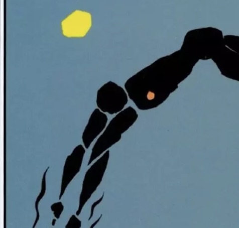
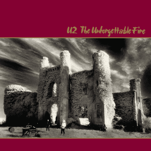
#19

“War,” U2, 1983
U2’s first two LPs focused on adolescence (“Boy,” 1980) and spirituality (“October,” 1981), and the band made a conscious decision “to give people a slap in the face by calling the new one ‘War’ and get away from the cozy image many people had of U2,” said Bono in 1982. The Edge added, “It’s a heavy title, but we wanted to take a more dangerous course and fly a bit closer to the wind. It seemed appropriate.” They used a closeup photograph of 10-year-old Peter Rowen, the much younger brother of Bono’s friend Derek Rowen, staring seriously into the camera. “Instead of putting tanks and guns on the cover, we put a child’s face,” Bono explained. “War can also be a mental thing, an emotional thing between loves.”
#20
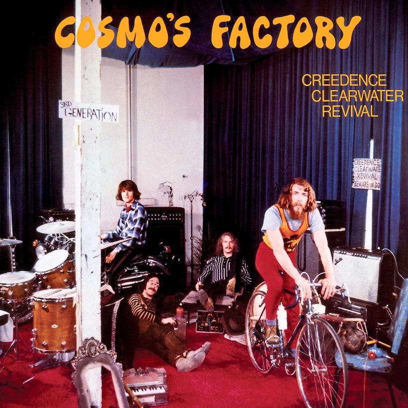
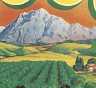
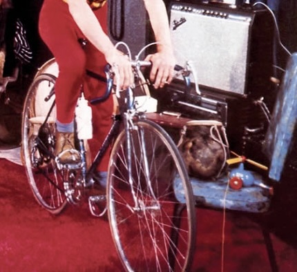
“Cosmo’s Factory,” Creedence Clearwater Revival, 1970
During their heyday, Creedence was perhaps the most prolific band going, releasing six albums and 15 singles in less than three years. “Cosmo’s Factory,” their fifth LP, showcased their pleasing mix of R&B, soul, vintage rock and country. Its name came from drummer Doug “Cosmo” Clifford, who moaned about all the rehearsing leader John Fogerty made the band do in a warehouse in Berkeley, which he dubbed “The Factory.” Fogerty’s brother Bob snapped the cover photo during a moment of downtime when the band was hanging out amongst their instruments, bicycles and motorcycles. The hand-lettered sign “3rd Generation” on the post refers to a phrase critic Ralph Gleason used to describe the band’s San Francisco roots.
#21
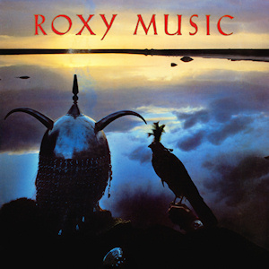
“Avalon,” Roxy Music, 1982
Bryan Ferry, Roxy Music’s lead singer and chief songwriter, had decided in 1982 that the band’s next LP would be their last before he embarked on a solo career. “I started working on the songs for the album on the west coast of Ireland, on the very lake that’s used in the photograph on the album cover,” Ferry said. “I thought this was the most romantic, dream-like album I’d ever done.” Art director Peter Saville sent photographer Neil Kirk to Lough Ugga Beag in County Galway, where he shot a robed figure in medieval helmet, holding a merlin falcon as they looked out over the lake at dawn. Ferry noted, “In the King Arthur legend, Avalon is the Isle of Enchantment, a fantasy place, a very romantic place, and it was the perfect title for the album.”
#22
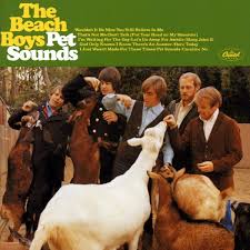
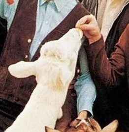
“Pet Sounds,” The Beach Boys, 1966
This groundbreaking album, which featured ambitious production, sophisticated harmonic structures and coming-of-age lyrical themes, proved hugely influential in the pop/rock music community. Brian Wilson poured everything he had into the development of the 13 songs he co-wrote with collaborator Tony Asher, and he took to calling these favorite musical ideas his “pet sounds,” which became the album title. The Capitol Records art department, then still in charge of what its clients’ album covers would look like, chose to stage a photo shoot at the San Diego Zoo showing the band members feeding goats. They then slapped on the band’s name, album title and track list of the songs, as was customary at the time. Asher was among those who didn’t care for the cover presentation or album title, saying, “It trivialized what we had accomplished.”
#23
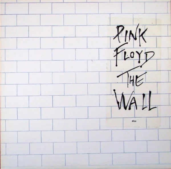
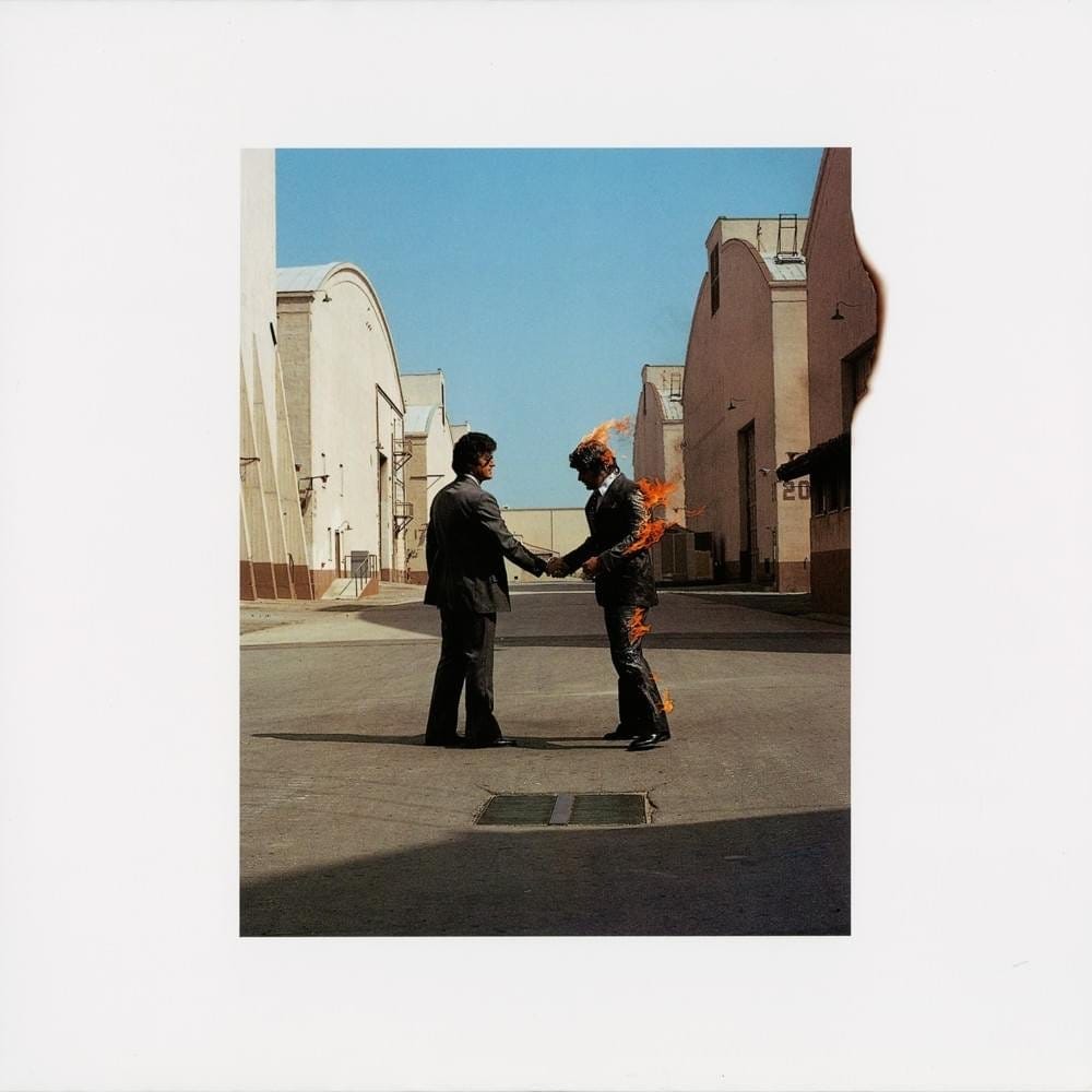
“The Wall,” Pink Floyd, 1979
Never interested in picturing themselves on their album covers, Pink Floyd was far more focused on making artistic statements on the front of their new releases. Their ’70s LPs — “Meddle,” “Dark Side of the Moon,” “Wish You Were Here” and “Animals” — all featured compelling artwork designed by the British consortium Hipgnosis and its chief designer Storm Thorgerson. A disagreement between him and Floyd’s de facto leader Roger Waters severed that relationship, and the band instead chose to underscore the isolationist theme of “The Wall” by using a minimalist depiction of a white brick wall with no text. The record label had illustrator Gerald Scarfe provide the band name and album title in stylized lettering that they put on a sticker on the shrink wrap (and, in later pressings, on the cover itself).
#24
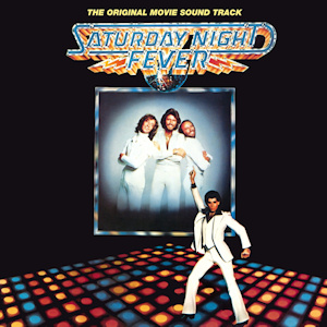
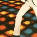
“Saturday Night Fever,” original soundtrack, 1977
A 1976 article in New York magazine entitled “Tribal Rites of the New Saturday Night,” a fictionalized exploration of Manhattan’s disco scene, was the impetus for producer Robert Stigwood’s movie “Saturday Night Fever,” an ultimately depressing story that nonetheless exploded in pop culture, thanks mostly to the insanely popular soundtrack album. It has sold over 40 million copies worldwide and turned The Bee Gees (already international pop stars) into the undisputed kings of disco (which both helped and hurt their long-term reputation). The album cover, like nearly every movie soundtrack album, merely used the film’s movie poster from its marketing campaign, which featured the Brothers Gibb and star John Travolta amidst the disco floor lights.
*****************************
The playlist below includes one song from each of the 24 albums featured here, and I decided to select mostly deeper tracks instead of the obvious (and overplayed) hits, just to broaden your appreciation of the music.