How much, how much do you really know?
In recent months, I’ve been testing my readers’ skills at recalling the words to well-known classic rock songs by offering a series of Lyrics Quiz posts, and I’ll continue to do so periodically.

With this week’s post, I’ll begin branching out into the broader area of classic rock trivia. I came across an old “special edition” of a Rolling Stone Rock Trivia Quiz and decided it was high time I put together my own set of multiple-choice questions for you all to answer.
So here it is: My first Hack’s Back Pages Rock Trivia Quiz! Peruse the 15 questions and multiple-choice possible answers, then scroll down to find the answers and learn more about the topics raised. At the end, there’s also a Spotify playlist of the songs being discussed here.
I hope you get a kick out of this one!
**********************************

1. “Brown-Eyed Girl” may get more airplay than any other Van Morrison song, but which of his singles charted higher on the US Top 40 listings?
“Moondance”; “Tupelo Honey”; “Domino”; “Wild Night”

2. Blind Faith was comprised of superstars Eric Clapton, Steve Winwood and Ginger Baker…and a fourth, much lesser known musician on bass. Who was it?
Trevor Bolder; Ric Grech; Clive Chaman; John Glascock

3. Which of these four songs does NOT feature mandolin?
“Losing My Religion,” R.E.M.; “The Battle of Evermore,” Led Zeppelin; “Wild Horses,” The Rolling Stones; “Friend of the Devil,” The Grateful Dead

4. Major Tom is the main character in David Bowie’s 1969 debut single “Space Oddity.” In which Bowie song does Major Tom make a return appearance?
“Fame”; “Let’s Dance”; “Ashes to Ashes”; “Heroes”
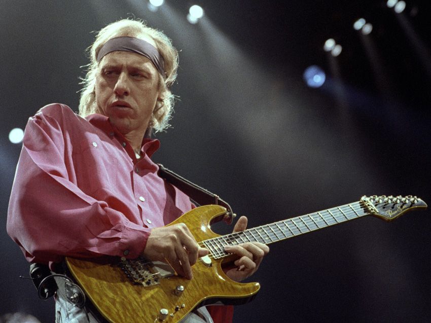
5. On which Steely Dan single does Dire Straits’ Mark Knopfler make a guest appearance on guitar?
“Peg”; “Time Out of Mind”; “FM”; “Rikki Don’t Lose That Number”
6. Of these four songs Ringo Starr sang in The Beatles catalog, which one did he write?
“Yellow Submarine”; “Act Naturally”; “Good Night”; “Octopus’s Garden”
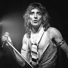
7. On which song does Rod Stewart encourage you to “spread your wings and let me come inside”?
“Maggie May”; “Hot Legs”; “Tonight’s the Night”; “Do Ya Think I’m Sexy?”
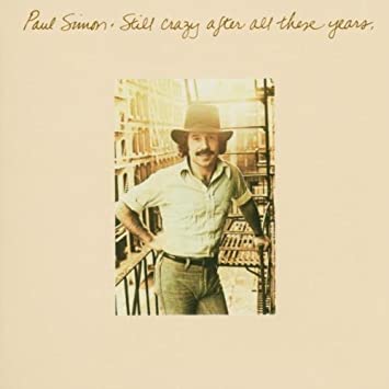
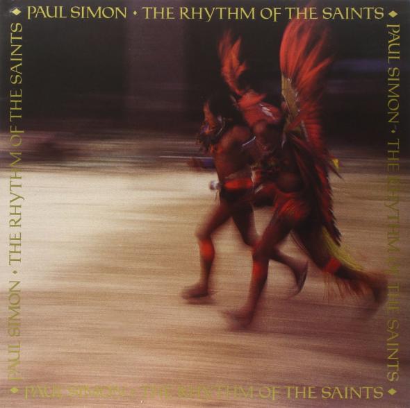
8. Which Paul Simon album was originally intended to be a Simon and Garfunkel reunion album?


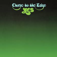
9. Of these lengthy classic rock tracks that occupy an entire album side, which one clocks in as the longest?


10. Which of these four artists did not record a song with Paul McCartney?


11. Which one of these pairs of artists did NOT record a song together?
Joni Mitchell and Michael McDonald; Bob Dylan and Johnny Cash; Phil Collins and Philip Bailey; Elton John and Freddie Mercury
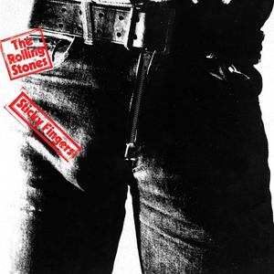
12. Which album cover from the 1970s was designed by pop artist Andy Warhol?

13. Which one of these talented women sings harmony vocals with Neil Young on his hit singles “Heart of Gold” and “Old Man”?


14. Which lead guitarist was never a member of The Yardbirds?


15. Who was Barbra Streisand’s first choice to be her co-star in the 1976 film “A Star is Born”?

*********************************
*
*
*
*
*
*
*
*
*
*
*
*
ANSWERS:

1. “Domino”
Morrison had an acrimonious relationship with his late ’60s label, Bang Records, for whom he recorded “Brown-Eyed Girl.” Although royalties from that tune have padded his bank account every day since its release, he claims to hate it and rarely will play it anymore in concert. It reached #10 in 1967, but his upbeat song “Domino” from the 1970 LP “His Band and the Street Choir” actually reached one rung higher on the charts at #9. “Moondance,” from the 1970 album of the same name, is well-known but wasn’t released as a single in 1970 and performed poorly upon release as a single in 1977, stalling at #92. “Tupelo Honey” and “Wild Night” from the 1971 “Tupelo Honey” album managed only #47 and #28, respectively.
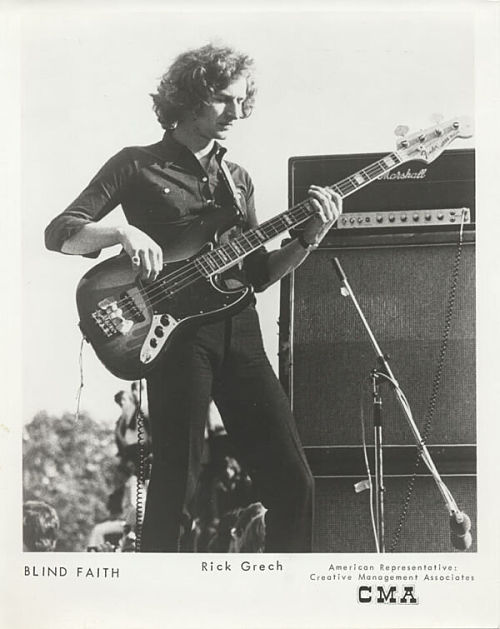
2. Ric Grech
Grech was a multi-instrumentalist who had written songs and played bass and violin for Family, a relatively obscure British progressive rock group known for a diversity of styles and lineups. He was tapped to fill out the ranks of Blind Faith, which lasted for less than six months, one brief tour and one album before disbanding. Winwood later invited Grech to join the reconvened Traffic in time for their popular LP “The Low Spark of High-Heeled Boys.” The other names mentioned above: Trevor Bolder became bassist in David Bowie’s backup band, The Spiders From Mars; Clive Chaman was the bass player for The Jeff Beck Group for a spell; and John Glascock was Jethro Tull’s bassist from 1976-1979.

3. “Wild Horses,” The Rolling Stones
While this is one of the handful of songs in the Stones catalog that has a strong country music influence, “Wild Horses” does not include mandolin in the instrumental arrangement. There’s plenty of pedal steel guitar, and slide guitar, and Jagger’s vocals have a bit of Southern drawl, all a result of country rock pioneer Gram Parsons hanging out with the band during the 1969-1972 years. On Zeppelin’s “The Battle of Evermore,” keyboardist/bassist John Paul Jones picks up a mandolin to complement Jimmy Page’s acoustic guitar; R.E.M. guitarist Peter Buck uses mandolin as the primary instrument as Michael Stipe sings “Losing My Religion”; and guest mandolinist David Grisman’s flourishes on mandolin become increasingly prominent with each successive verse of The Grateful Dead’s “Friend of the Devil.”
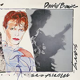
4. “Ashes to Ashes”
“Ashes to ashes, funk to funky, we know Major Tom’s a junkie, /Strung out in heaven’s high, hitting an all-time low…” These are lyrics from the chorus of the hit single from Bowie’s 1980 LP “Scary Monsters.” Bowie himself acknowledged in 1990 that the words reflect his own struggles with drug addiction throughout the 1970s. He said he wrote “Ashes to Ashes” as a confrontation with his past: “You have to accommodate your pasts within your persona. You have to understand why you went through them. You cannot just ignore them, put them out of your mind or pretend they didn’t happen, or just say, ‘Oh, I was different then.'”
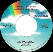
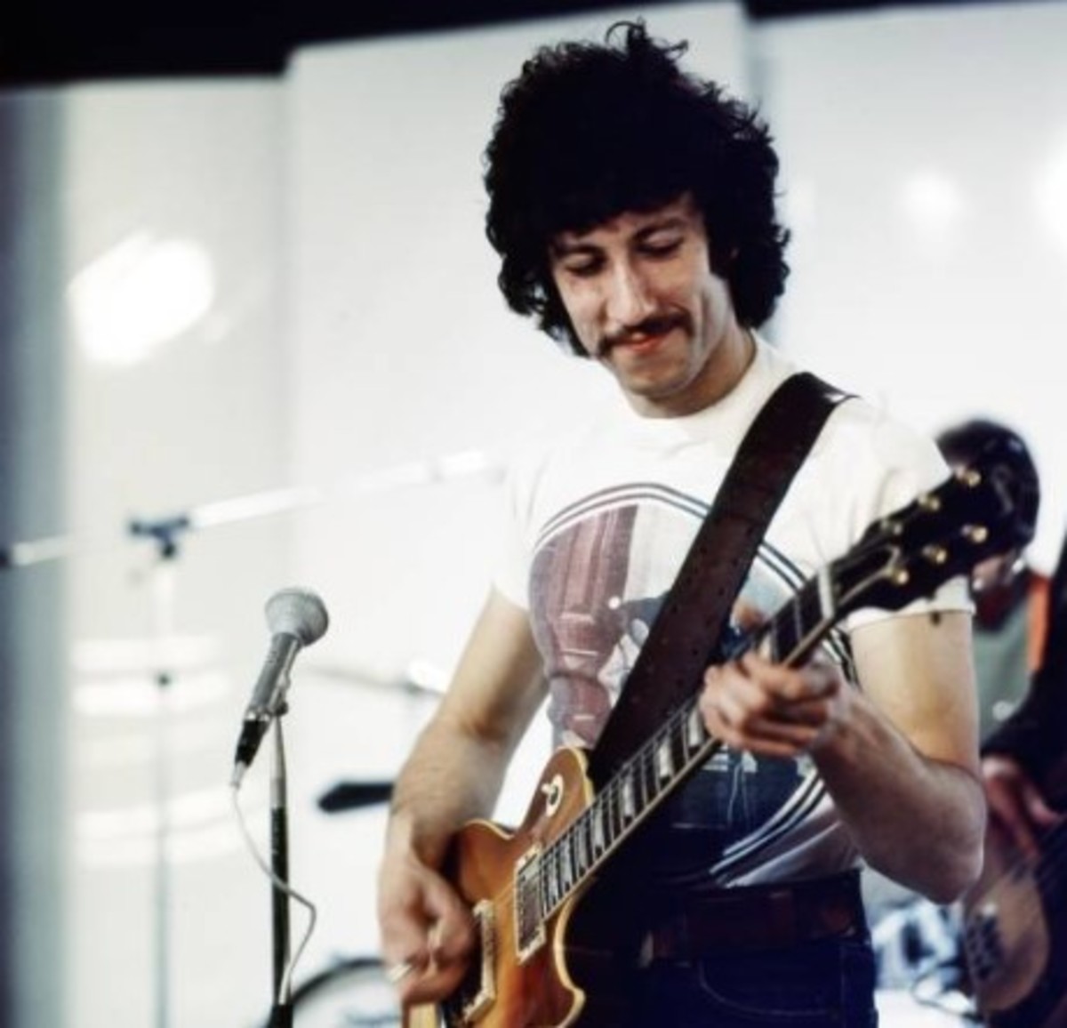
5. “Time Out of Mind”
Although Steely Dan first recorded and performed as a six-man band when they debuted in 1972, they soon became sort of a studio laboratory run by Donald Fagen and Walter Becker, who brought in a wide array of session guitarists, drummers, bassists and background singers to play on the various album tracks. Particularly on their albums “The Royal Scam” (1976), “Aja” (1977) and “Gaucho” (1980), Fagen and Becker tried out as many as a dozen guitarists to play solos before finding the one they were looking for. On the “Gaucho” track “Time Out of Mind,” Mark Knopfler’s spare, fluid style was just what the songwriters were seeking. It was a modest hit, reaching #22 in early 1981. You can also hear Michael McDonald providing guest vocals behind Fagen on this one.

6. “Octopus’s Garden”
From their very first album onward, The Beatles made a point of featuring Ringo on vocals on at least one track. It was sometimes a cover of an earlier rock hit — The Shirrelles’ “Boys,” the Carl Perkins tunes “Matchbox” and “Honey Don’t,” or the Buck Owens hit “Act Naturally.” More often, it was a Lennon-McCartney original they wrote with Starr in mind: “I Wanna Be Your Man,” “What Goes On,” “Yellow Submarine,” “With a Little Help From My Friends.” Ringo tried in vain to write songs, but they ended up being little more than rewrites of someone else’s tune. He came up with the simple country ditty “Don’t Pass Me By” which appears on Side 2 of “The White Album,” and then, during the sessions for “Abbey Road,” he wrote “Octopus’s Garden,” which he regarded as “a sequel to ‘Yellow Submarine.'” George Harrison helped out with a marvelous guitar intro, and John, Paul and George all added harmonies.
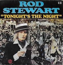
7. “Tonight’s the Night”
Almost from the beginning, Stewart projected a playfully naughty image as a lovable rascal who’d love to take you to bed. He hung out with — and sometimes married — attractive, much younger women, and the lyrics of the songs he chose to record and release as singles were fairly obvious in their sexual overtures. “Maggie May” (1971) tells the tale of a young man’s first sexual experience with a much older woman; “Hot Legs” (1978) is about a young woman who drops by only for spirited, casual sex; and “Do Ya Think I’m Sexy?” (1978) is about a couple of strangers who lust for each other and are at first too shy to make a move but end up doing the deed. “Tonight’s the Night,” though, is the one that features the lyric in question, which was boldly blatant about what he wanted from the young lady.
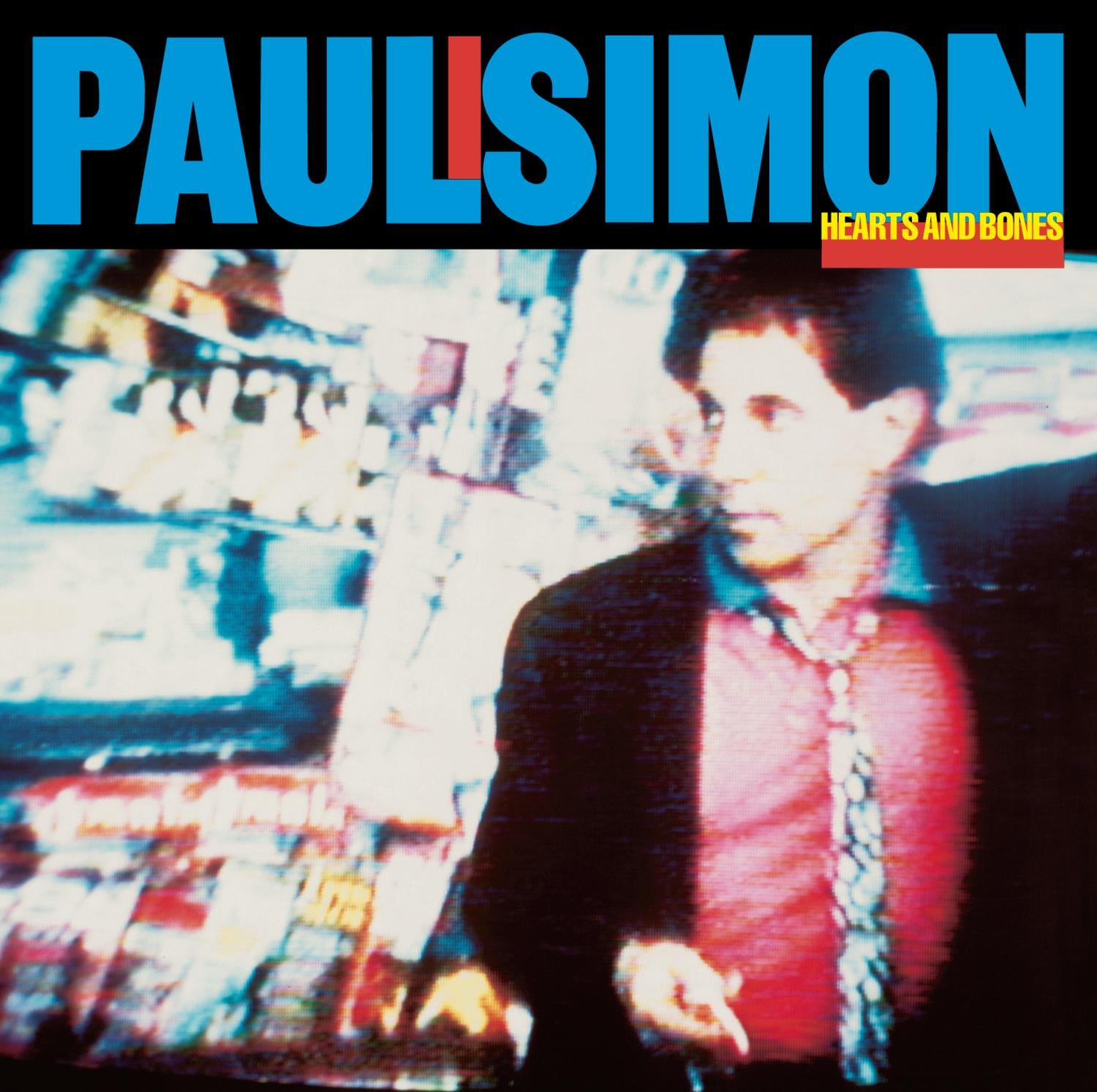
8. “Hearts and Bones”
When Simon made the daring decision in 1970 to end his enormously successful partnership with Art Garfunkel, it was because he wanted to explore new musical territories that he felt weren’t a good match for the Simon-Garfunkel tight harmonies. In 1975, the duo reunited, but for only one song, “My Little Town,” which appeared on his “Still Crazy After All These Years” album AND Garfunkel’s “Breakaway” LP. In 1983, following a spectacularly successful reunion concert, video and album in Central Park, Simon and Garfunkel did a reunion tour, and started work on a full S&G album, but the pair had a falling out, and Simon actually erased Garfunkel’s vocal parts and made the album a solo work called “Hearts and Bones.” The other two albums listed, 1991’s “The Rhythm of the Saints” and 2000’s “You’re the One,” had no involvement from Garfunkel.
9. “Echoes,” Pink Floyd
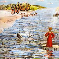
From the late ’60s through the mid-’70s, progressive rock bands were eager to push the boundaries of rock music, not only in format and influences but in length as well. British artists like King Crimson, Pink Floyd, Genesis, Jethro Tull and Yes wrote songs that lasted more than 15 or 20 minutes. American and Canadian acts from Frank Zappa and Bob Dylan to Rush and Styx got in the act as well. In 1968, California’s Iron Butterfly was one of the first bands to take up a whole album side, releasing the stoner classic “In-A-Gadda-da-Vida,” but it lasted just 17:05. Yes released “Close to the Edge” in 1972, and its title track was 18:43 in length. Genesis, with Peter Gabriel still firmly in charge, released the 23:06-long “Supper’s Ready” in 1972. The winner, though, is Pink Floyds “Echoes,” from their 1971 album “Meddle,” which edges out “Supper’s Ready” by a half minute at 23:31.
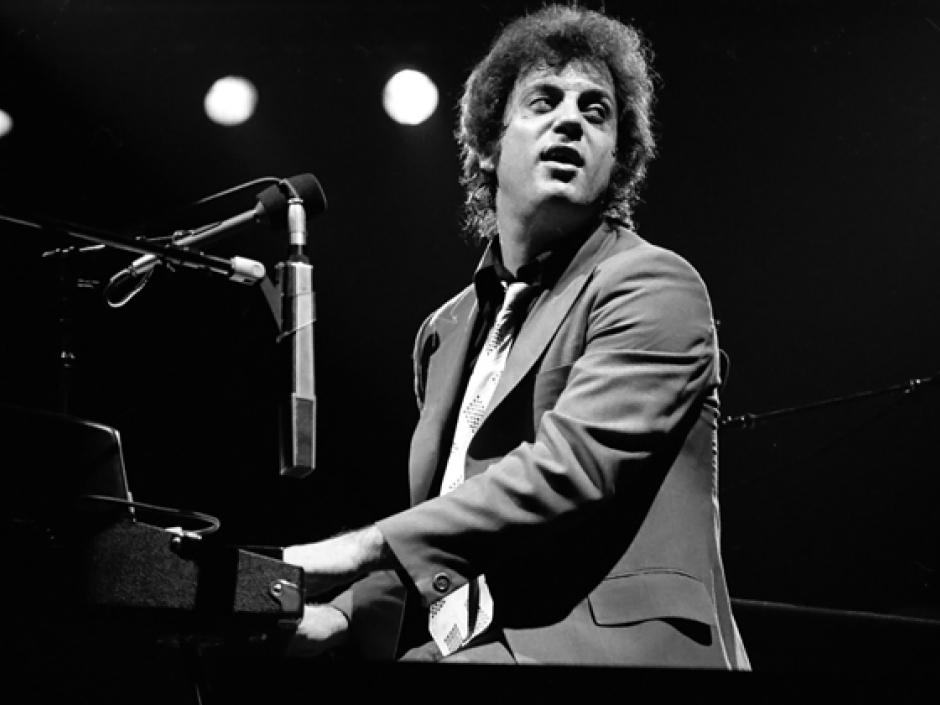
10. Billy Joel
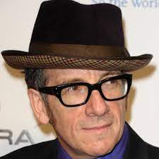
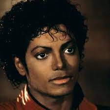
You can look at the accessible pop songcraft of Joel from his earliest work onward and assume he’d be a perfect match for McCartney’s similar vein of highly melodic material… but no, they never worked together. In 1982, McCartney teamed up with Stevie Wonder for the massive hit “Ebony and Ivory” and also “What’s That You’re Doing,” both from his “Tug of War” LP. In the 1982-83 period, McCartney collaborated successfully with Michael Jackson on three hits: “The Girl is Mine” from Jackson’s “Thriller” album, and “Say Say Say” and “The Man” from McCartney’s “Pipes of Peace” LP. In 1989, following poor sales of his previous album “Press to Play,” McCartney struck an alliance with Elvis Costello on four of the 12 songs on “Flowers in the Dirt,” as well as Costello’s hit “Veronica” the same year.

11. Elton John and Freddie Mercury
These two bombastic Brits were both prone to big, splashy theatrics in their performances, and they were good friends, so you’d think a duet would’ve been a natural for them, but it never happened. On the other hand, the other three pairs of artists found great results pooling their talents on various recordings. For her “Dog Eat Dog” album in 1985, Joni Mitchell invited ex-Doobie Brother Michael McDonald to perform a duet with her on “Good Friends,” which stiffed as a single at #85 but reached #28 on Mainstream Rock charts. In 1984, for his third solo LP, “Chinese Wall,” Philip Bailey of Earth Wind & Fire collaborated with Phil Collins, who produced the album, played drums throughout, and co-wrote and sang on the international #1 hit “Easy Lover.” Back in 1969, Johnny Cash sang a duet with Bob Dylan on his “Nashville Skyline” album on a re-recording of Dylan’s 1963 tune “Girl From the North Country.”

12. “Sticky Fingers,” The Rolling Stones
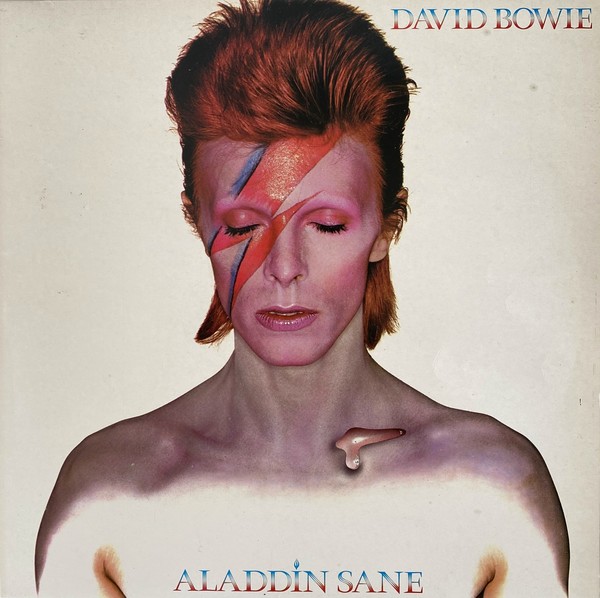
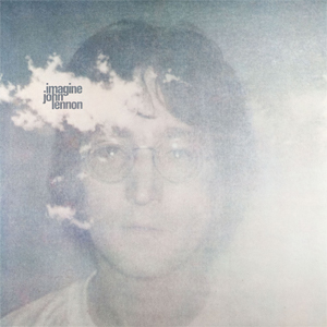
One of the earliest examples of a controversial album cover design that made it into production was the infamous tight jeans close-up on The Stones’ “Sticky Fingers” LP, courtesy of Andy Warhol. Although members of his design collaborative, The Factory, actually implemented the design and photography, Warhol conceived of the idea, which Mick Jagger enthusiastically endorsed. The actual working zipper on the original pressing was later removed because it tended to damage albums during shipping. Hipgnosis, a British graphic design group that created album covers for Pink Floyd, Led Zeppelin, Alan Parsons Project and more, came up with the award-winning “Dark Side of the Moon” cover art. Famed fashion and portrait photographer Brian Duffy, who worked often with David Bowie, shot and created the cover for Bowie’s “Aladdin Sane” album. Warhol was rumored to have shot the polaroid photo of John Lennon for his “Imagine” cover, but it was instead taken by Yoko Ono.

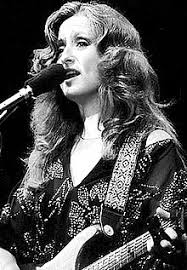
13. Linda Ronstadt
Young went to Nashville in 1971 to appear on a taping of the ABC musical variety show “The Johnny Cash Show,” where Linda Ronstadt and James Taylor were also scheduled to appear. Immediately following the taping, Young invited Ronstadt and Taylor to a nearby studio, where he had assembled some country musicians to record some tracks for a new project that would become the chart-topping “Harvest” LP. It’s difficult to make out Taylor’s voice in the mix of either “Heart of Gold” or “Old Man,” but Ronstadt’s voice is easily identifiable. Young has shared the stage with Joni Mitchell, notably for The Band’s “The Last Waltz” album and concert film. Young performed with Bonnie Raitt at least once, at the Bay Area Music Awards ceremony in 1990. As far as I can tell from online research, Young and Carly Simon have never performed or recorded together.
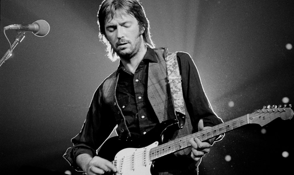
14. Peter Green
Peter Green was a brilliant blues guitarist who played first with John Mayall and then formed Fleetwood Mac in 1967. He never served with The Yardbirds, a blues-based band later noted for their “rave-up” instrumental breaks. Tony “Top” Topham was the group’s original lead guitarist, but he lasted only a few months and was replaced by hot new blues guitar sensation Eric Clapton. He remained for a year and a half but, as a blues purist, he was turned off by their pop single “For Your Love” and left to join Mayall’s Bluesbreakers (and then Cream). Clapton recommended prominent session guitarist Jimmy Page, who said no and suggested Jeff Beck instead, who was instrumental in their most fertile period on such Yardbirds hits as “Shapes of Things” and “Heart Full of Soul.” Page ended up joining later on bass, then played guitar alongside Beck for several months before Beck grew disillusioned and split. Page stayed on until the group’s disbanding in 1968, turning it into first The New Yardbirds and then Led Zeppelin.

15. Elvis Presley
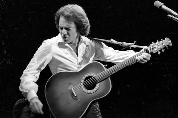
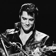
In the 1927 and 1945 versions of “A Star is Born,” the story centered on an aspiring actress and declining actor, but in 1975, Streisand was interested in reviving the film by making it about the music business instead. Consequently, when she went looking for a co-star to play the part of the singer on his way down, she wanted someone who could both sing and act. Neil Diamond made the short list as a possible candidate. Rick Nelson might’ve worked, and Jerry Lee Lewis as well, but neither were ever under consideration. (The studio mentioned Marlon Brando, who was ruled out because he wasn’t a singer.). Streisand was eager to get Elvis Presley, who met with them and was interested in taking the part, but imperious manager “Colonel” Tom Parker demanded top billing for Elvis and asked for too much money. He also objected to Elvis portraying someone whose career was in decline. Filmmakers instead settled on Kris Kristofferson, an acclaimed songwriter and actor.
*******************************