Oh God, I need a drink of cool cool rain
“Life isn’t about waiting for the storm to pass. It’s about learning to dance in the rain.” — Vivian Greene
“Some people feel the rain. Others just get wet.” — Bob Marley
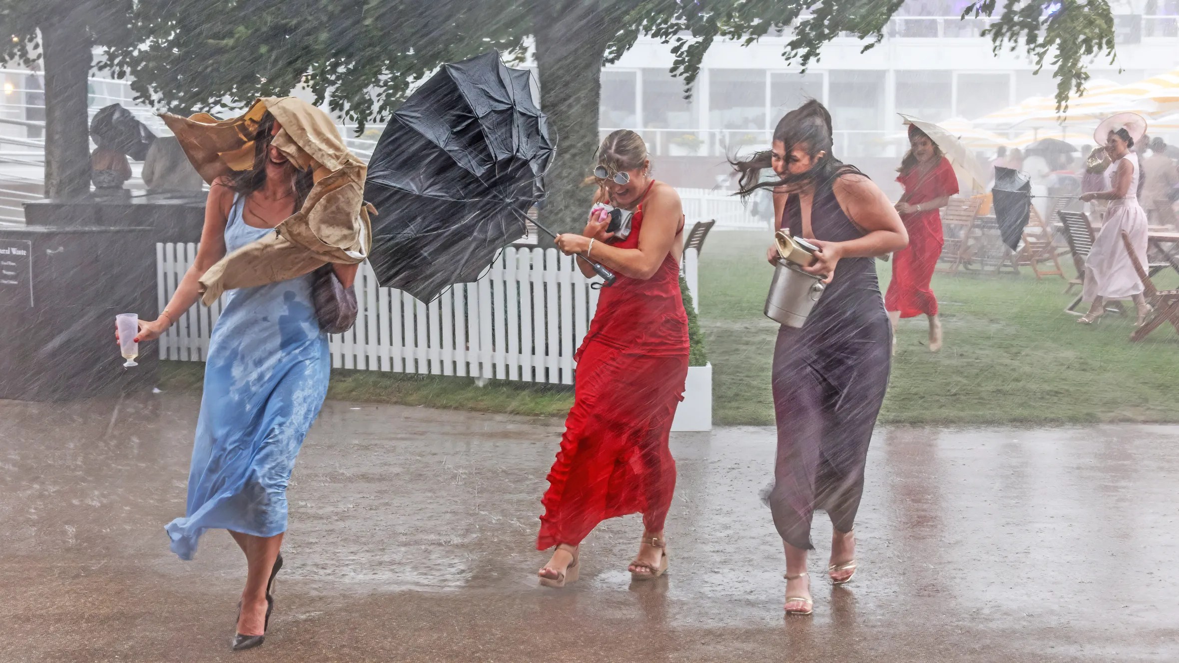
And right there, in a nutshell, are two quotes to sum up the best way to look at rain. We can’t control the weather, but we can control our attitude. We had best learn to live with the possibility, the inevitability, that rain might spoil the outdoor wedding reception or postpone the baseball game, but it’ll also feed the farmer’s crops and nurture your own flower garden.
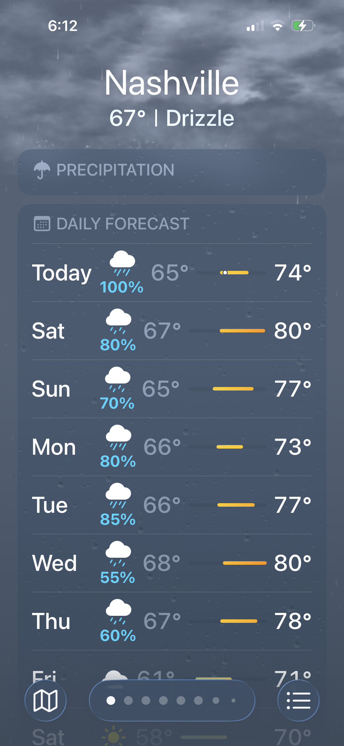
Still, a rainy day has a nagging way of altering our mood if we let it. Take a look at the weather forecast for the next week for the Nashville area, where I live. Some would call that depressing. But there hasn’t been much rain here so far this spring, so it’s needed. We can change our plans and do some indoor activities, or we can slip on some boots and grab an umbrella for a nice invigorating walk in the rain. Maybe even leave the umbrella at home and get gloriously drenched!
Granted, when rain turns to torrents and floods, it can be a big problem. Mostly, though, it makes the eventual sunny days seem all the more welcome in comparison.
Songwriters have known this for a century or more. It’s one of the most covered topics in popular music, and sifting through the voluminous list of songs about rain turned out to be a big job. I chose two dozen songs to feature here, and nearly another two dozen in a group of “honorable mentions.” Taken together in two Spotify playlists included at the end, you’ll find three and a half hours of music as a soundtrack for any rainy day.
As the old song goes, “Into each life, some rain must fall…”
****************************
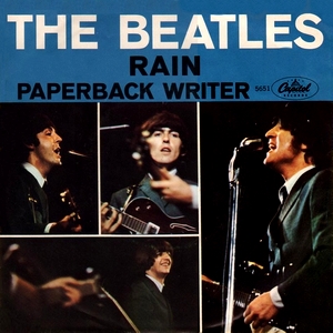
“Rain,” The Beatles, 1966
This John Lennon track broke new ground in Beatles studio productions as the flip-side of the “Paperback Writer” single during the “Revolver” sessions in the spring of 1966. In addition to some amazing drum work by Ringo (he called it his favorite bit of drumming on a Beatles tune), the track features some startling backward-tape vocals of the line “If the rain comes, they run and hide their heads” at the fadeout. The lyrics are matter-of-fact about accepting the weather whatever it might happen to be: “Rain, I don’t mind, /Shine, the weather’s fine, /Can you hear me, that when it rains and shines, /It’s just a state of mind, can you hear me?…”

“Here Comes That Rainy Day Feeling Again,” The Fortunes, 1971
This British harmony beat group hit the US Top Ten in 1965 with “You’ve Got Your Troubles,” and they were the band behind the 1969 Coke commercial theme song, “It’s the Real Thing.” In 1971, The Fortunes had a #15 hit with “Here Comes That Rainy Day Feeling Again,” an earworm by Tony Macauley that captured the analogy between rain and heartbreak: “Here comes that rainy day feeling again, and soon my tears they will be falling like rain, /It always seems to be a Monday, leftover memories of Sunday, /Always spent with you until the clouds appeared and took away my sunshine…”
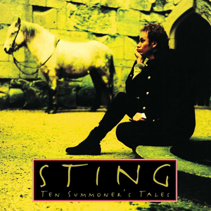
“Heavy Cloud No Rain,” Sting, 1993
Because Sting’s 1990 LP, “The Soul Cages,” was decidedly downbeat in the wake of his father’s death, he said he made a concerted effort for the follow-up to be more optimistic. 1993’s “Ten Summoner’s Tales” is indeed sunnier, with hits like “Fields of Gold” and “If I Ever Lose My Faith in You,” which helped it secure multiple Grammy nominations including Album of the Year. Still, one of the more compelling tracks, “Heavy Cloud No Rain,” talks about the disappointment of unfulfilled expectations: “I asked my baby if there’d be some way, she said she’d save her love for a rainy day, /I look in the sky, but I look in vain, /Heavy cloud but no rain…”
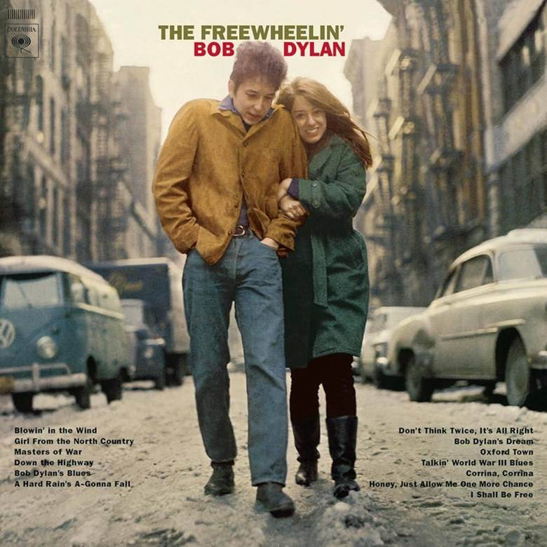
“A Hard Rain’s Gonna Fall,” Bob Dylan, 1963
After a tentative debut LP in 1962, Dylan dropped the musical equivalent of a nuclear bomb on an unsuspecting public with “The Freewheeling’ Bob Dylan” in 1963, chock full of stunning original songs that challenged listeners with literary, thought-provoking lyrics never heard before in the popular song arena. “A Hard Rain’s Gonna Fall” was originally interpreted as a warning of nuclear fallout sparked by the Cuban Missile Crisis, but Dylan wrote it several months before that conflict (although it wasn’t released until the spring of 1963). He said, “It’s not atomic rain, it’s just a hard rain…a rain of lies we’re getting in our newspapers. It’s the common destiny of the human being getting thrown off course. It’s all one long funeral song.”
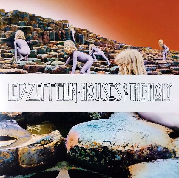
“The Rain Song,” Led Zeppelin, 1973
George Harrison once told Jimmy Page that Led Zeppelin should do more ballads, and Page came up with this seven-minute beauty from the “Houses of the Holy” LP. Robert Plant, who has said this is one of his favorite recorded vocal tracks, wrote lyrics that examine the variety of emotions we experience as the seasons change, using rain as a metaphor for life’s twists and turns that we must endure: “Upon us all, upon us all a little rain must fall…it’s just a little rain…”
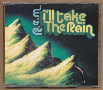
“I’ll Take the Rain,” R.E.M., 2001
Lead singer Michael Stipe implores us to “celebrate the rain” in this melodic track from R.E.M.’s eighth Top Ten LP, 2001’s “Reveal.” The Athens, Georgia-based group did well with “I’ll Take the Rain” when it was released as a single in the UK, but it failed to chart here, which is a pity, because it’s a real winner. The lyrics point out how, sometimes, the rain is the better option: “You cling to this, you claim the best, if this is what you’re offering, I’ll take the rain…”
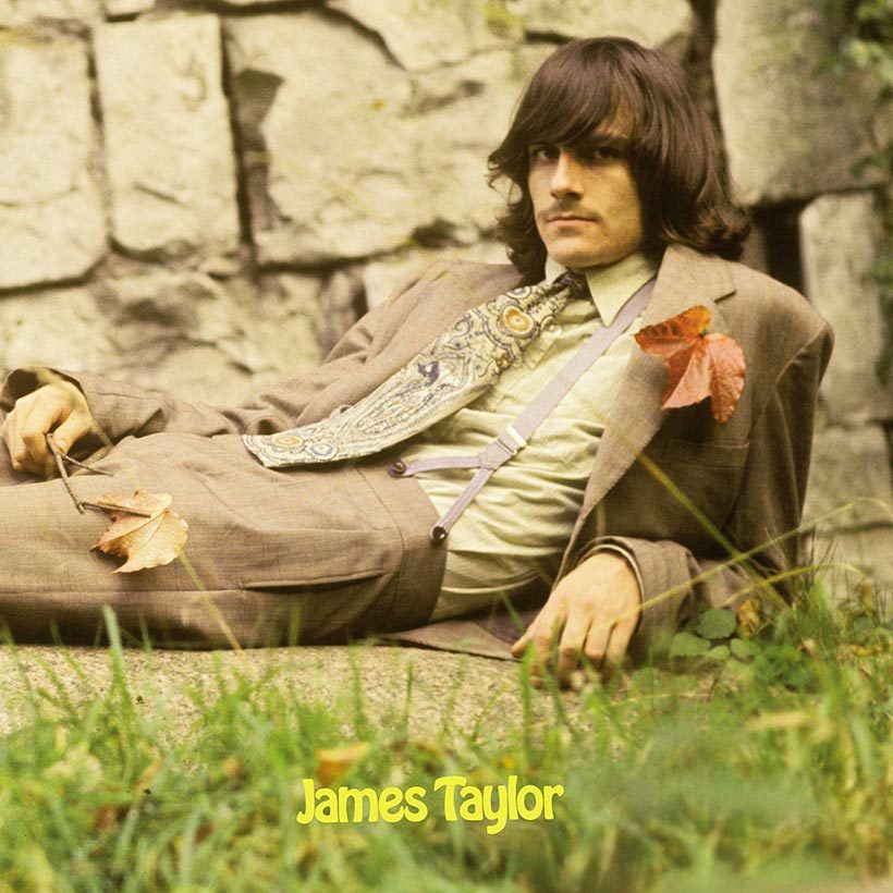
“Rainy Day Man,” James Taylor, 1969
First released on Taylor’s overlooked debut album on Apple Records in 1969, and re-recorded in 1979 on his “Flag” LP, the wistful “Rainy Day Man” offers emotional support in the form of a shoulder to cry on when times are hard. When recently asked to name his five favorite songs of his huge catalog, this was one of the more surprising picks: “It looks like another fall, your good friends don’t seem to help at all, now when you’re feeling kind of cold and small, just look up your rainy day man…”
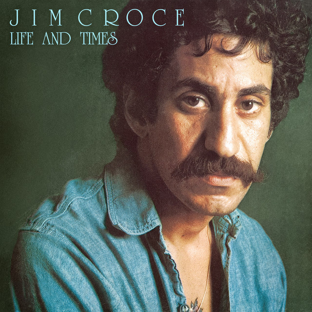
“Alabama Rain,” Jim Croce, 1973
It wasn’t a single and never got much exposure, but “Alabama Rain” is my favorite of Jim Croce’s songs. It evokes such a soft, warm feeling of romance and contentment, the kind of joy where we don’t even mind getting caught in the rain while taking a walk together. It appeared on his “Life and Times” LP in 1973, released only months before his premature death: “Lazy days in mid-July, country Sunday mornings, /Dusty haze on summer highways, sweet magnolia calling, /Now and then I find myself thinking of the days when we were walking in the Alabama rain…”
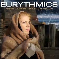
“Here Comes the Rain Again,” Eurythmics, 1983
Dave Stewart, the musical maestro behind much of the Eurythmics’ catalog, said he wanted to compose “a song that went in and out of melancholy, using minor and major chords. I think it has a kind of dark beauty.” A synthesizer-based foundation was augmented by layers of orchestral tracks and Annie Lennox’s strong vocals, and the result was “Here Comes the Rain Again,” a #4 hit in the US in 1983. The lyrics have an “in and out of melancholy” nature too: “Here comes the rain again, raining in my head like a tragedy, tearing me apart like a new emotion, /I want to breathe in the open wind, I want to kiss like lovers do…”
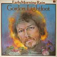
“Early Morning Rain,” Gordon Lightfoot, 1966
Regarded as a national treasure in his native Canada, Lightfoot wrote thoughtful songs that painted vivid pictures, and some of his best early songs in the mid-’60s were recorded by other artists like Peter, Paul & Mary, Ian & Sylvia, Bob Dylan and Elvis Presley, who each tried their hand at the angst-ridden “Early Morning Rain.” It’s one of Lightfoot’s best, with lyrics that capture how a drifter might feel on a rainy morning when he realizes his habit of hopping on freight trains was becoming obsolete in the then-new era of airplane travel: “This old airport’s got me down, it ain’t no earthly good to me, and I’m stuck here on the ground, cold and drunk as I might be, can’t jump a jet plane like you can a freight train, so I best be on my way, in the early morning rain…”
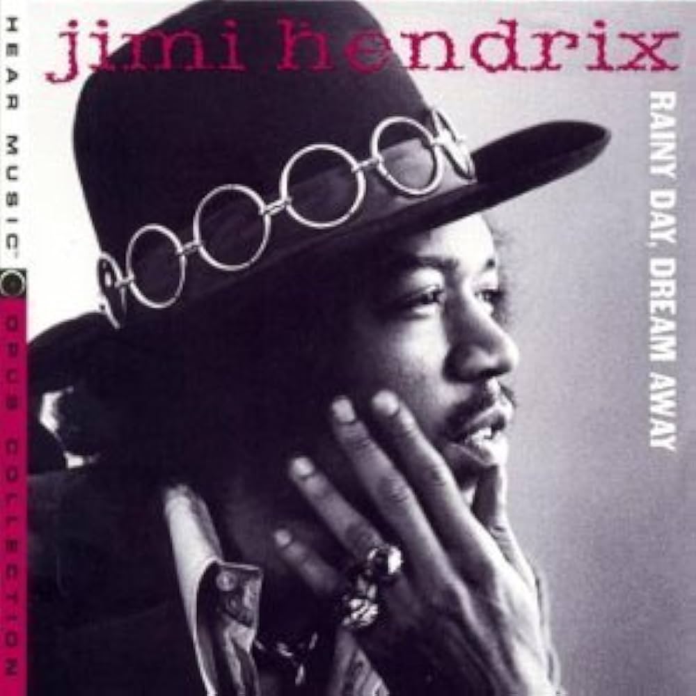
“Rainy Day, Dream Away/Still Raining, Still Dreaming,” Jimi Hendrix, 1968
Many of the sessions for his “Electric Ladyland” double LP saw Hendrix jamming with a range of guest musicians outside the Experience trio format. These two companion tracks, which began sides three and four, featured Hendrix and regular bassist Noel Redding collaborating with Buddy Miles on drums, Mike Finnigan on Hammond B3 organ and Larry Faucette on congas. Together they created the feeling that the rain was continuing to fall all day and night during recording. And hey, as Jimi would say, it’s all good: “Rainy day, rain all day, ain’t no use in getting uptight, just let it groove its own way, /Let it drain your worries away, lay back and groove on a rainy day…”
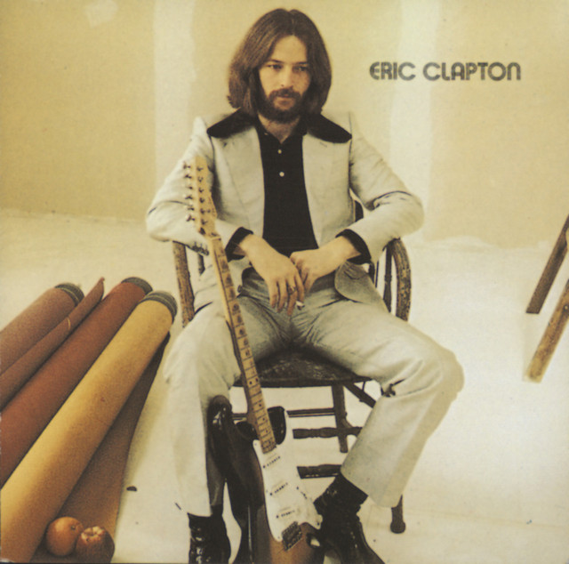
“Let It Rain,” Eric Clapton, 1970
Following his celebrated stints with John Mayall’s Bluesbreakers, Cream and Blind Faith, Clapton assembled an all-star team of musicians to help him produce his debut solo LP, notably Leon Russell, Stephen Stills, and Delaney Bramlett. The album’s best song, in my view, is “Let It Rain,” a joyous, gorgeous track with a fantastic solo at the end. Originally called “And She Rides” with different lyrics, the finished track instead uses words that lovingly celebrate the healing power of rain: “The rain is falling through the mist of sorrow that surrounded me, /The sun could never thaw away the bliss that lays around me, /Let it rain, let it rain, let your love rain down on me…”
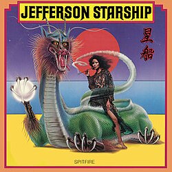
“Song to the Sun/Don’t Let It Rain,” Jefferson Starship, 1976
When the original Jefferson Airplane called it quits in 1972, guitarist/singer/songwriter Paul Kantner teamed up with Grace Slick and recruited guitarist Craig Chaquico, bassist Pete Sears, keyboardist David Freiberg and drummer Johnny Barbata to form a splinter group he called Jefferson Starship. He eventually convinced Airplane co-founder Marty Balin to return to the fold for three LPs in the mid-’70s, one of which, “Spitfire,” included the dynamic track “Don’t Let It Rain,” which could arguably be called an answer to Clapton’s earlier anthem, with words that plead for the rain to stay away: “Don’t let it rain on me tonight, don’t let it rain, /I need to feel the sun again, please don’t let it rain…”
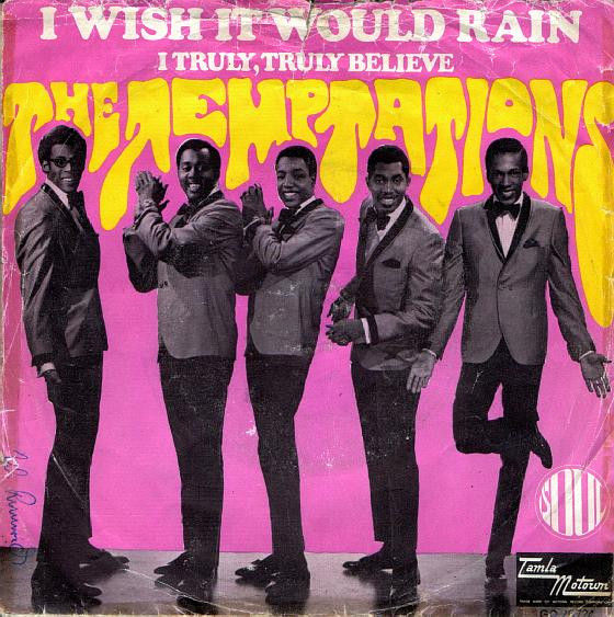
“I Wish It Would Rain,” The Temptations, 1967
Norman Whitfield and Barrett Strong, one of Motown’s most accomplished songwriting/producing teams, worked often with The Temptations. This track from 1967, which featured the gritty lead vocals of David Ruffin before he split for a solo career, did a marvelous job of showing how a heartbroken man can have trouble facing a sunny day, surrounded by happy people: “Day after day, I stay locked up in my room… my tear-stained face pressed against the windowpane, my eyes search the sky desperately for rain, ’cause raindrops will hide my teardrops… I just wish it would rain…”
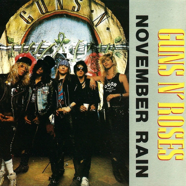
“November Rain,” Guns ‘n Roses, 1991
Lead singer Axl Rose allegedly worked on this brilliant power ballad for more than eight years before he finally got the recording he wanted, completed with sweeping orchestral backing and one of guitarist Slash’s best solos. One of Guns ‘n Roses’ finest tracks by far, “November Rain” is “about not wanting to have to deal with unrequited love,” said Rose. It showed up on the band’s “Use Your Illusion I” LP in 1991, with lyrics which reflect the difficulty of wanting hope but feeling despair: “Nothing lasts forever, and we both know hearts can change, and it’s hard to hold a candle in the cold November rain…”
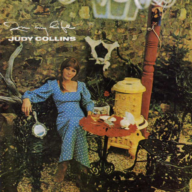
“I Think It’s Going to Rain Today,” Judy Collins, 1966
One of Newman’s most covered compositions is this wistful piece first recorded by Judy Collins on her “In My Life” LP. There are more than 50 renditions to check out: Bette Midler, Peter Gabriel, Cass Elliot, UB40, Norah Jones, Joe Cocker, Neil Diamond and Newman himself, to name just a few. Newman said he wrote it as early as 1963 or 1964, saying “the music is emotional, even beautiful, but the lyrics are not. They’re kind of sophomoric, and a little too maudlin.” I beg to differ; I think the gorgeous melody is embellished by lyrics of powerful empathy: “Right before me, the signs implore me, help the needy and show them the way, human kindness is overflowing, and I think it’s going to rain today…”
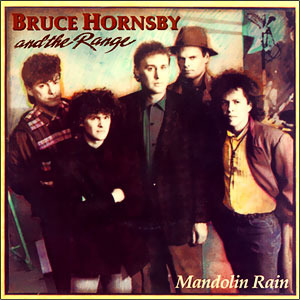
“Mandolin Rain,” Bruce Hornsby and The Range, 1986
Coming from a musically inclined Virginia family, Hornsby studied music, played in club combos and spent time in Los Angeles as a session musician, where he met former Ambrosia bassist Joe Puerta and formed a band he called The Range. Hornsby wrote a strong batch of songs with his brother John that earned a record deal with RCA, and the title song, “The Way It Is,” became a #1 hit in the fall of 1986. The follow-up single, “Mandolin Rain,” which peaked at #4 in early 1987, “is about trying to pull through when so many things remind you of the person you once loved,” he said: “Listen to the mandolin rain, listen to the music on the lake, /Ah, listen to my heart break every time she runs away, /Oh, listen to the banjo wind, a sad song drifting low, /Listen to the tears roll down my face as she turns to go…”
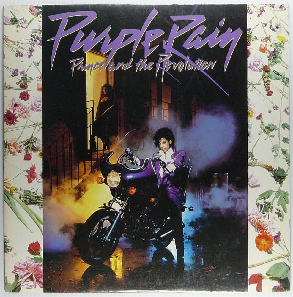
“Purple Rain,” Prince, 1984
Ever since Prince’s riveting performance of this anthem in a downpour at the halftime show of the 2007 Super Bowl, it’s the image I think of whenever I hear it. He had built a sizable following between 1979-1983, but the release of the album and film “Purple Rain” in 1984 sent his career into the stratosphere. “When Doves Cry,” “Let’s Go Crazy” and “I Would Die 4 U” were all monster hits for him that year, but the title track, with lyrics drenched in sadness, is probably the signature song of his whole career: “I never meant to cause you any sorrow, I never meant to cause you any pain, I only wanted one time to see you laughing in the purple rain, purple rain…”
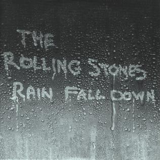
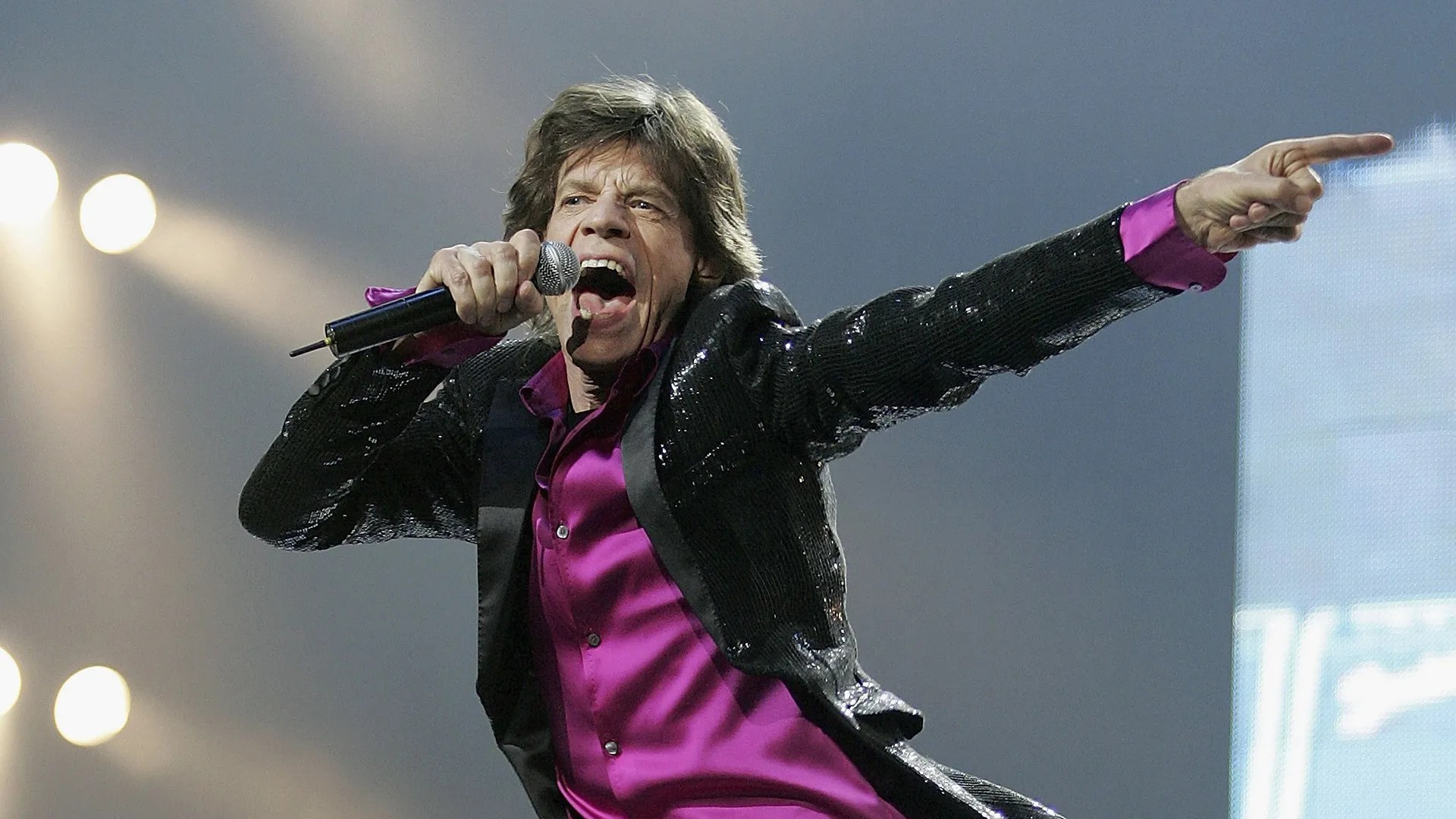
“Rain Fall Down,” The Rolling Stones, 2005
After several ho-hum albums in the 1990s, it was a nice surprise to hear Mick Jagger and Keith Richards come up with an instant classic like this one on The Stones’ “A Bigger Bang” album in 2005, a half-century after “(I Can’t Get No) Satisfaction.” Thanks to Richards’ memorable riff, there’s something a little spooky and relentless about “Rain Fall Down,” and Jagger’s lyrics are full of queasy images that ultimately point toward the relentlessness of rain that never seems to stop: “And the rain fell down on the cold grey town, and the phone kept ringing, /And we made sweet love… and the phone kept ringing… and the rain… rain… rain…”
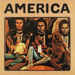
“Rainy Day,” America, 1972
America had plenty of commercial hits in their repertoire (“A Horse With No Name,” “Sister Golden Hair,” “Ventura Highway”), but as has often been the case with some artists, I found myself partial to some of the lesser known tracks like “Rainy Day” from their 1972 debut LP. Dan Peek (who wrote it), Dewey Bunnell and Gerry Beckley combined soothing harmonies with intricate acoustic guitars to create the perfect environment for lyrics that point out how inclement weather makes some people want to curl up at home under a warm blanket: “Whenever it’s a rainy day, I pack my troubles up in my room, /I chase all the clouds away, I get myself back to the womb…”
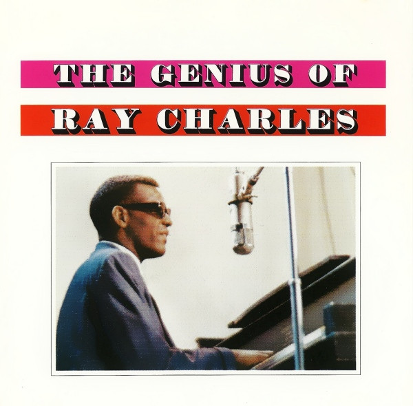
“Come Rain or Come Shine,” Ray Charles, 1959
Harold Arlen, one of the top composers of pop/jazz standards of the ’30s and ’40s, worked with different lyricists but still ended up with several chart favorites that had weather-related themes (“Stormy Weather,” “Over the Rainbow,” “When the Sun Comes Out”). He teamed up with the legendary Johnny Mercer in 1946 to write “Come Rain or Come Shine” for the Broadway musical “St. Louis Woman,” and it became a modest hit for Margaret Whiting that year, reaching #17 on US pop charts. Since then it has been covered hundreds of times by the likes of Frank Sinatra, Billie Holiday, Barbra Streisand, B.B. King and Eric Clapton, but my favorite is probably the version Ray Charles recorded in 1959. Mercer’s lyrics speak of a love that lasts regardless of what life has in store: “We’ll be happy together, unhappy together, now won’t that be just fine, /The days may be cloudy or sunny, we’re in or out of the money, /But I’m with you always, I’m with you rain or shine…”
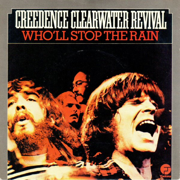
“Who’ll Stop the Rain,” Creedence Clearwater Revival, 1970
John Fogerty watched from a dry tent as hundreds of concertgoers at Woodstock danced, huddled and sang naked in the endless deluge that turned the festival grounds into a sea of mud. As he wrote about that experience weeks later for the Creedence single “Who’ll Stop the Rain,” he realized how he could make the lyrics also have a deeper meaning: Who will stop the rain of bombs in the Vietnam war, and the rain of bullshit coming from all the politicians in Washington? “Long as I remember, the rain been comin’ down, /Clouds of mystery pourin’ confusion on the ground, /Good men through the ages tryin’ to find the sun, /And I wonder, still I wonder, who’ll stop the rain?…”
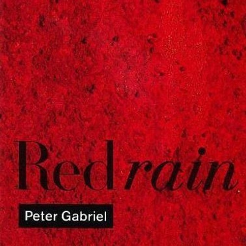
“Red Rain,” Peter Gabriel, 1986
The theme of this brooding opening cut from Gabriel’s “So” LP was inspired by recurring dreams he was having: swimming in his pool while drinking red wine; and bottles falling off a cliff and smashing on impact, sending red liquid everwhere. He had also conceived of a movie in which native villagers were punished for their sins with blood-red rainstorms. Critics praised the song’s descending melody as “a soothing metaphor for an apocalyptic downpour.” While “Sledgehammer,” “Big Time” and “In Your Eyes” got most of the attention, “Red Rain” stalled at #46 in the UK as a single and didn’t chart on the US pop chart but reached #3 on the Mainstream Rock chart as a favorite of FM radio programmers. “I can’t watch anymore, no more denial, /It’s so hard to lay down in all of this red rain coming down, /Red rain is pouring down, red rain is coming down all over me…“
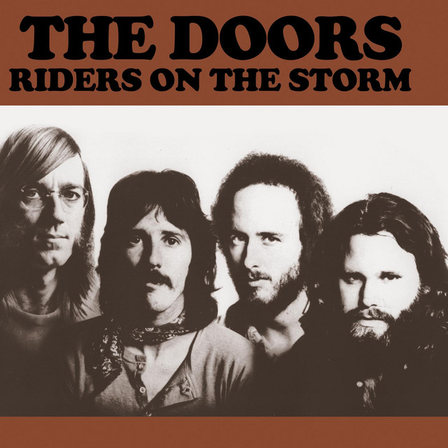
“Riders on the Storm,” The Doors, 1971
In what turned out to be Jim Morrison’s final recorded moment, The Doors used the portentous sounds of a thunderstorm in the introduction and throughout its spooky musical track about a night stalker (“a killer on the road“). “Riders on the Storm” may be the best nighttime driving-in-the-rain song of all time, carried by Ray Manzarek’s jazzy electric piano and Morrison’s haunting vocals. Lyrics that offer the ominous warning “If you give this man a ride, sweet family will die” firmly underscore the sense of dread oozing from this chilling recording.
******************************
Honorable mentions:
“Fire and Rain,” James Taylor, 1970; “Cold Rain,” Crosby, Stills and Nash, 1977; “Looking at the Rain,” Gordon Lightfoot, 1972; “Caught in the Rain,” Batdorf and Rodney, 1975; “Box of Rain,” Grateful Dead, 1970; “Save It For a Rainy Day,” Stephen Bishop, 1976; “Summer Rain,” Johnny Rivers, 1967; “It’s Raining Again,” Supertramp, 1982; “Fool in the Rain,” Led Zeppelin, 1979; “Rain Rain Rain,” Roxy Music, 1980; “Have You Ever Seen the Rain,” Creedence Clearwater Revival, 1972; “It Never Rains in Southern California,” Albert Hammond, 1972; “It’s Raining,” Peter, Paul & Mary, 1964; “Rhythm of the Rain,” The Cascades, 1962; “Rainy Days and Mondays,” The Carpenters, 1971; “Baby the Rain Must Fall,” Glenn Yarbrough, 1964; “Rainy Night in Georgia,” Brooks Benton, 1970; “Laughter in the Rain,” Neil Sedaka, 1974; “Singin’ in the Rain,” Gene Kelly, 1952; “Don’t Rain on My Parade,” Barbra Streisand, 1968; “It’s Raining Men,” The Weather Girls, 1982; “Love Reign O’er Me,” The Who, 1973.
*******************************